sales@wildnetedge.com
 +1 (212) 901 8616
 +1 (437) 225-7733


 ChatGPT Development & Enablement
  Hire AI & ChatGPT Experts
  ChatGPT Apps by Industry
  ChatGPT Blog
  ChatGPT Case study
  AI Development Services
  Industry AI Solutions
  AI Consulting & Research
  Automation & Intelligence


TL;DR
Great Mobile App UI Design decides whether users stay or uninstall. In 2026, successful apps follow clear mobile UI patterns, prioritize thumb-friendly layouts, and apply proven UX design principles to reduce effort and confusion. This guide explains how to design intuitive app interfaces using modern app UI trends, accessibility standards, and performance-aware design. The goal is simple: help users complete tasks faster, with less thinking, and more confidence.
Users decide if they like an app almost instantly. They don’t read instructions. They don’t explore patiently. They tap, scroll, and judge.
That’s why Mobile App UI Design is no longer just a visual exercise; it’s a business decision. If users struggle to find actions, understand screens, or trust the interface, they leave.
Many apps fail because they try to squeeze desktop thinking into a mobile screen. Mobile users behave differently. They use one hand, switch contexts constantly, and expect things to “just work.” Good UI respects these realities and removes friction at every step.
This guide focuses on what actually works on mobile, not trends for the sake of trends.
Mobile-First Thinking: Design for the Hand, Not the Screen
The Thumb Zone Rule
Most users operate their phone with one thumb. Effective Mobile App UI Design places key actions primary buttons, navigation, confirmations within easy thumb reach, usually in the lower half of the screen. Top areas are best used for viewing, not interacting. This reduces strain, errors, and frustration.
Proper Touch Target Sizes
Small buttons cause mistakes. Mobile design guidelines recommend minimum touch targets of 44×44 pixels. Clear spacing between elements prevents accidental taps and builds confidence in the interface. Utilising expert product design services ensures that these ergonomic constraints are tested early in the prototyping phase, preventing usability issues before code is written.
Clarity Beats Decoration Every Time
Strong Visual Hierarchy
Users scan screens, but don’t read them. A good hierarchy tells users what matters most using size, contrast, and spacing. Headlines lead, supporting text follows, actions stand out.
If everything looks important, nothing is.
Use White Space Intentionally
White space isn’t wasted space. It separates content, reduces mental effort, and makes interfaces feel calm and premium. Clean layouts are easier to understand and faster to use.
Navigation Should Feel Familiar
Stick to Proven Mobile UI Patterns
Bottom navigation bars, back gestures, and standard icons exist for a reason. Familiar mobile UI patterns reduce learning time and help users move naturally through the app. Avoid clever navigation that forces users to learn new behaviors.
Gesture-Based Interactions
Swipes, pulls, and long-presses feel natural on mobile. When used consistently and clearly, gestures speed up interaction and reduce visual clutter. Just make sure gestures are predictable and supported with subtle cues.
Accessibility Is Not Optional
Readable Text and Color Contrast
Text must be readable in all conditions. Strong contrast, legible font sizes, and scalable typography are essential parts of Mobile App UI Design. Supporting system font scaling ensures usability for all users.
Dark Mode Done Right
Dark mode is now expected. Designing for it means more than color inversion. Depth, elevation, and contrast must be rethought so that the content remains clear and usable in low-light environments.
Visual Consistency and Branding
Consistency builds trust. If the “Submit” button is blue on one page and green on another, the user gets confused.
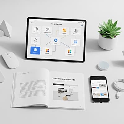
Design Systems
To maintain consistency, mature teams use a Design System a library of reusable components and guidelines. This ensures that every toggle, card, and modal looks and behaves the same way. A professional UI/UX design company will always start by establishing this system, which serves as the single source of truth for both designers and developers.
Brand Integration
Your app is an extension of your brand, but it shouldn’t look like a print ad. Mobile App UI Design must balance brand personality with platform conventions. Use your brand colors for primary actions, but stick to standard system colors for warnings (red) and success messages (green) to ensure clarity.
Micro-Interactions Make Apps Feel Alive
Immediate Feedback Matters
Every tap should respond. Subtle animations, loading states, or haptic feedback reassure users that the app is working. Without feedback, users assume something is broken.
Small Moments of Delight
Thoughtful animations and transitions add personality without distraction. These details turn functional screens into enjoyable experiences and improve retention.
Design With Performance in Mind
Skeleton Screens Over Spinners
Skeleton screens show users where content will appear while loading. This feels faster than a generic spinner and sets expectations clearly.
Optimize Visual Assets
Use scalable vectors, compressed images, and multiple screen densities. Heavy visuals slow apps down and slow apps get deleted. UI and performance must work together. Collaborating with mobile app development teams is crucial here to ensure that the beautiful design doesn’t bloat the application bundle.
Case Studies: Design Driving Success
Real-world examples illustrate the impact of these best practices.
Case Study 1: Fintech App Simplification
- The Challenge: A banking app had a high churn rate. Users found the dashboard cluttered and couldn’t find the “Transfer Money” feature. The legacy Mobile App UI Design was mimicking their complex desktop website.
- Our Solution: We applied the “Thumb Zone” rule, moving key actions to a bottom floating action button (FAB). We utilized negative space to de-clutter the transaction history.
- The Result: User engagement increased by 40%, and support tickets regarding navigation dropped by 70%. The simplified interface made complex financial tasks feel easy.
Case Study 2: E-commerce Visual Overhaul
- The Challenge: A fashion retailer had low conversion rates. The product images were small, and the “Add to Cart” button was hard to see.
- Our Solution: We implemented a card-based Mobile App UI Design with edge-to-edge photography. We used a sticky “Add to Cart” bar that remained visible as the user scrolled.
- The Result: Conversion rates jumped by 25%. The focus on high-quality visuals and accessible calls-to-action removed the friction from the buying process.
What’s Next in Mobile App UI Design
Adaptive, AI-Driven Interfaces
Interfaces will soon adjust automatically larger text for accessibility needs, shortcuts for power users, simplified flows for new users.
Beyond Screens
Voice, haptics, and wearables will require designers to think less about visuals and more about feedback, flow, and intent.
Conclusion
Great Mobile App UI Design feels effortless. Users don’t notice it—they just get things done quickly and comfortably.
By following proven UX design principles, respecting mobile ergonomics, and using familiar mobile UI patterns, you create intuitive app interfaces that users trust and return to.
Design is not decoration. It’s communication. And when done right, it becomes your strongest growth driver. At Wildnet Edge, our design-first approach ensures we build interfaces that are beautiful, intuitive, and built for the future.
FAQs
The most important element is clarity. In a small space, users need to understand immediately what they are looking at and what they can do. Clutter is the enemy of mobile design; every pixel must serve a purpose to guide the user toward their goal.
UX (User Experience) focuses on the overall feel of the experience and the logic of the user flow (how a user gets from A to B). UI (User Interface) focuses on the visual look—the colors, typography, and button styles. Effective Mobile App UI Design requires both to work in harmony.
The industry standards are Figma, Sketch, and Adobe XD. These tools allow designers to create vector-based layouts, prototype interactive flows, and hand off assets to developers seamlessly. Figma is particularly popular for its collaborative features.
Dark Mode reduces eye strain in low-light environments and saves battery life on OLED screens. It has become a standard user preference. A robust design strategy must include a dedicated dark theme that maintains color contrast and brand integrity.
You test it through usability testing with real users. Create a clickable prototype and ask users to perform specific tasks (e.g., “Find the settings menu”). Observe where they get stuck. This feedback loop is essential for refining Mobile UX/UI before writing code.
Yes. iOS uses the Human Interface Guidelines (HIG), favoring blur effects and flat navigation. Android uses Material Design, favoring depth, shadows, and card-based layouts. Good Mobile UX/UI respects these platform-specific conventions to feel “native” to the device.
A micro-interaction is a small, functional animation that provides feedback. Examples include the “heart” animation when you like a post, the vibration when you pull to refresh, or a toggle switch sliding from off to on. These details make the interface feel responsive and alive.

Managing Director (MD) Nitin Agarwal is a veteran in custom software development. He is fascinated by how software can turn ideas into real-world solutions. With extensive experience designing scalable and efficient systems, he focuses on creating software that delivers tangible results. Nitin enjoys exploring emerging technologies, taking on challenging projects, and mentoring teams to bring ideas to life. He believes that good software is not just about code; it’s about understanding problems and creating value for users. For him, great software combines thoughtful design, clever engineering, and a clear understanding of the problems it’s meant to solve.