sales@wildnetedge.com
 +1 (212) 901 8616
 +1 (437) 225-7733


 ChatGPT Development & Enablement
 Hire AI & ChatGPT Experts
 ChatGPT Apps by Industry
 ChatGPT Blog
 ChatGPT Case study
 AI Development Services
 Industry AI Solutions
 AI Consulting & Research
 Automation & Intelligence


Mobile-First Web Design Services for Responsive Experiences
We build digital experiences that prioritize mobile usability, performance, and speed, so your brand doesn’t just show up on mobile, it leads.
Why
WildnetEdge
for Mobile-First Web Design?
We build with mobile-first intent, not mobile-last adaptations. With over two decades of experience in web engineering and a deep understanding of evolving user behavior, we specialize in crafting responsive, high-performance websites that don’t just shrink to fit mobile; they’re made for it. that don’t just shrink to fit mobile; they’re made for it.
We go beyond basic responsiveness. Our mobile-first design approach integrates UX strategy, performance engineering, and device-specific optimization to ensure your website feels fast, intuitive, and impactful, no matter the screen.

Discovery & Mobile Strategy
We start by understanding your users, goals, and traffic patterns. With mobile behavior front and center, we define a UX strategy that supports conversions, accessibility, and speed.

Wireframing & Mobile-First Layout Design
Before the pixels come in, we map every screen and interaction for mobile. Clean, user-friendly wireframes are crafted to guide seamless navigation, swipe gestures, and core user flows.

Visual Design & Responsive Breakpoints
Our designers bring visual life to the wireframes with scalable UI systems and defined breakpoints for different devices. Your brand identity is fully translated into a mobile-optimized experience.

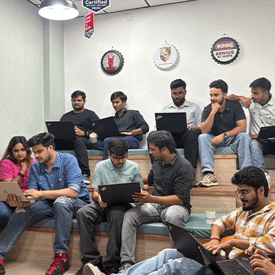
Responsive Front-End Development
Using modern frameworks like Tailwind, React, or Vue, our front-end development engineers build fluid layouts, responsive components, and fully adaptable interfaces with zero layout shifts and minimal code bloat.

Performance Optimization
We compress images, minify assets, optimize loading behavior, and integrate CDNs to ensure lightning-fast performance, even on 3G networks or older devices.

Testing, QA & Launch
Before go-live, we run comprehensive device and browser testing across mobile platforms. We fine-tune based on real-user feedback and ensure everything meets accessibility, SEO, and UX standards.
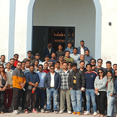
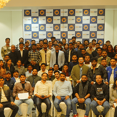
4.5  based on 1200+ reviews
 based on 1200+ reviews


Mobile-First Web Design,
Tailored to Your Industry
Every industry has unique user needs, and mobile-first design helps meet them faster. At WildnetEdge, we tailor each mobile-optimized experience to your sector’s specific workflows, compliance requirements, and user behavior.
Whether it’s a customer browsing your storefront on the go, a patient checking appointments from their phone, or a field agent using a web app in real-time, we design mobile-first to empower real-world users.
Healthcare
EHR, Telehealth, Appointment Scheduling, RCM Solutions

Finance
Fraud Detection, Digital Banking, Loan Origination, Regulatory Compliance Platforms
Retail & eCom
POS, Inventory, Loyalty Programs, Customer Insights
Education
Learning Platforms, Student Analytics, AI-Powered LMS

Real Estate
CRM, Virtual Tours, Property Management

Manufacturing
Industrial IoT, Predictive Maintenance, Workflow Automation
Aviation
Crew Scheduling, Maintenance Logs, Flight Tracking Software
Programming Languages
Java
Python
JavaScript
C#
C++
SQL
Frameworks
React
Angular
ASP.NET
Django
Ruby on Rails
Vue
DevOps & Cloud
AWS
Azure
Docker
Kubernetes
Terraform
GCP
AI/ML
TensorFlow
Pytorch
Open AI
HuggingFace
LangChain

Highlights:

“WildnetEdge truly exceeded our expectations. Their AI-first approach helped us streamline product development and automate key workflows, allowing our team to focus on innovation. Their proactive collaboration and agile execution felt like having a tech co-founder on our side.”
Samantha Roy
CTO

“Working with WildnetEdge was transformative. They brought deep expertise in AI, cloud, and agile delivery that enabled us to modernize legacy systems without disruption. Their ability to deliver complex solutions at scale made them an essential partner in our digital evolution.”
Rahul Menon
Head of Digital Strategy

“WildnetEdge brought structure and speed to a complex government initiative. Their AI-led solutions, commitment to security, and agile responsiveness allowed us to build better digital experiences for citizens—efficiently and effectively.”
Julia Fernandez
Director of Digital Services

“Partnering with WildnetEdge was a game-changer for our department. Their deep understanding of government processes, combined with cutting-edge AI capabilities, helped us modernize outdated systems with minimal disruption. The result? A faster, smarter, and more transparent public service delivery model.”
Marcus Hill
Chief Innovation Officer
Frequently Asked Questions
Mobile-first design starts by designing for the smallest screen, mobile, and then scaling up for larger devices. Responsive design adjusts existing layouts for different screen sizes. Mobile-first ensures the most important content and features are prioritized for mobile users from the very beginning, not retrofitted later.
More than half of all web traffic comes from mobile devices. A mobile-first website ensures better usability, faster load times, and higher engagement on phones and tablets, improving both customer experience and search engine rankings.
Yes. We specialize in redesigning and rebuilding desktop-centric websites into mobile-first experiences. We’ll audit your current site, map out high-priority content and interactions, and rebuild it for optimal mobile performance without compromising desktop functionality.
Absolutely. Google uses mobile-first indexing, meaning your mobile site is what’s evaluated for rankings. Fast-loading, mobile-optimized pages with great UX and accessibility directly improve SEO performance.
Any business with mobile users benefits, but especially eCommerce, logistics, education, SaaS, and service-based industries, where customers often browse, book, or purchase via mobile. If your audience is on the go, mobile-first is a must.
We optimize for real-world mobile conditions using best practices like image compression, lazy loading, streamlined code, and CDN integration. Our mobile-first websites are built to perform on everything from 5G to 3G.
Not always. A mobile-first web experience often eliminates the need for a native app, especially for content-driven or service-based businesses. But if your use case requires native features (like push notifications, offline access, or camera integration), we can advise whether a Progressive Web App (PWA) or native mobile app would be a better fit.


