sales@wildnetedge.com
 +1 (212) 901 8616
 +1 (437) 225-7733


 ChatGPT Development & Enablement
  Hire AI & ChatGPT Experts
  ChatGPT Apps by Industry
  ChatGPT Blog
  ChatGPT Case study
  AI Development Services
  Industry AI Solutions
  AI Consulting & Research
  Automation & Intelligence


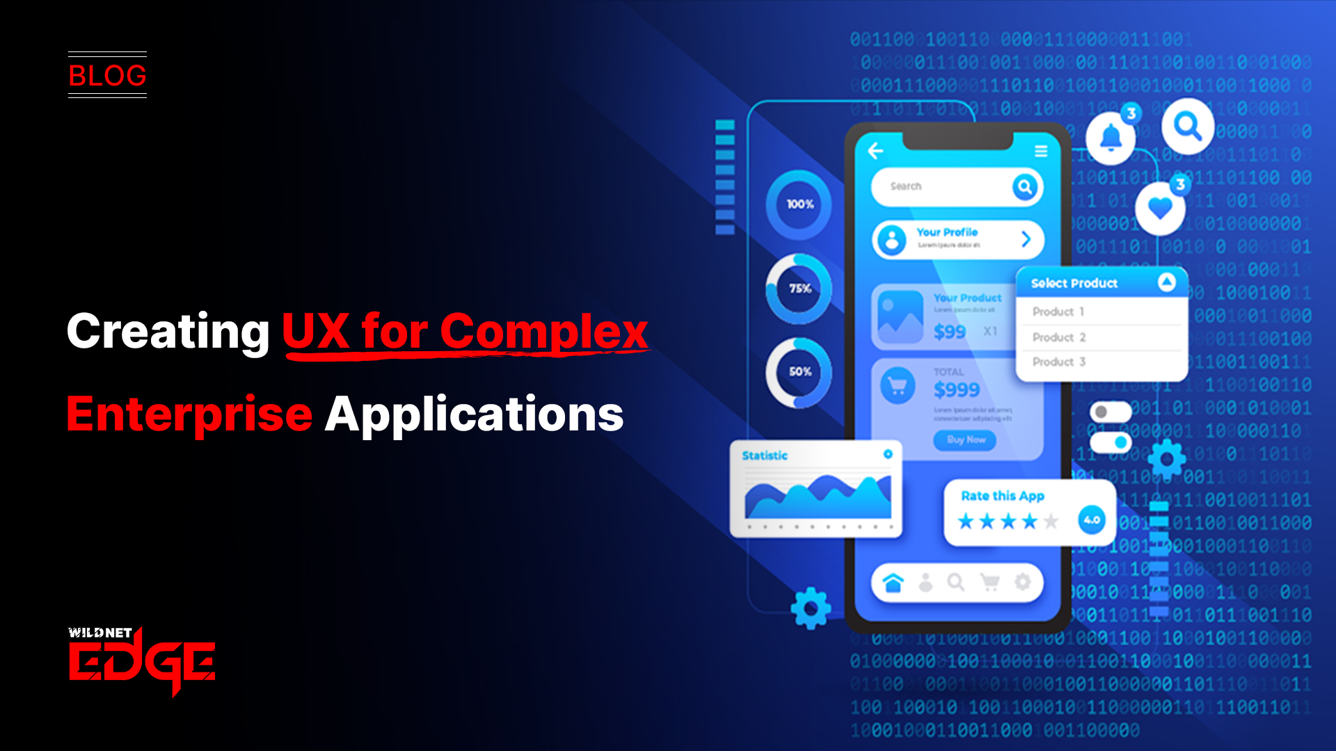

Are your enterprise apps drowning users in complexity? If your dashboards feel cluttered or your workflows seem convoluted, you’re not alone. Enterprise UX Design is critical to transforming complex software into intuitive experiences that boost productivity. In this guide, we’ll show you how to simplify dashboards UX and build workflow-focused interfaces that users actually want to use.
Complex enterprise applications typically juggle vast datasets, multiple user roles, and intricate processes — which can easily overwhelm the end user without the right UX approach. That’s why focusing specifically on enterprise UX design principles around dashboards UX and workflow-focused interfaces is the best way to create clarity, streamline tasks, and elevate overall user satisfaction.
Designing Intuitive Dashboards UX
Dashboards function as the control centers for enterprise users, serving up essential data and insights that inform critical business decisions. But a dashboard that’s cluttered with irrelevant information or poorly structured metrics quickly becomes more of a burden than a benefit.
Importance of Prioritizing Data and Metrics
The first step in effective enterprise dashboards UX is defining what truly matters to your users. Start by:
- Identifying key performance indicators (KPIs) most relevant to each user role.
- Filtering out low-priority or redundant data to reduce cognitive overload.
- Using data segmentation to customize dashboards dynamically based on user needs and context.
Enterprises using tools like Microsoft Power BI or Tableau in 2025 can leverage advanced AI-powered data recommendations to highlight the most relevant metrics, increasing dashboard relevance without manual configuration.
Using Visual Hierarchy and Layout Techniques
Applying visual hierarchy is indispensable—users should be guided naturally toward the most critical information first. Techniques include:
- Size and weight: Larger, bolder elements draw attention.
- Color coding: Use distinct colors to differentiate alert statuses or performance levels, but avoid overwhelming neon palettes.
- Whitespace: Balanced space improves scannability and reduces noise.
- Group related metrics: Cluster KPIs logically to simplify interpretation.
Grid-based layouts with modular widgets are popular for supporting responsiveness across devices, ensuring usability both on desktops and tablets.
Examples of Effective Dashboard Components
In 2025, interactive and context-aware components elevate dashboards UX:
- Dynamic charts & graphs that update in real-time.
- Heatmaps or trend indicators to spotlight changes quickly.
- Drill-down capabilities allowing users to deep dive into granular data without leaving the dashboard.
- Alert badges or notifications tied to actionable items guide users on follow-up tasks.
Avoiding Common Pitfalls Like Info Overload
Many enterprise dashboards fall into the trap of cramming too much data on one screen. To prevent info overload:
- Practice progressive disclosure inside dashboards, hiding secondary data behind expandable sections.
- Conduct frequent usability testing focusing on speed and accuracy of user decision-making.
- Limit the number of active widgets or visualizations per dashboard, ideally no more than 5–7 for efficient scanning.
By keeping dashboards clean, role-specific, and action-oriented, you ensure users spend less time sifting through data and more time executing decisions.
Building Workflow-Focused Interfaces for Enterprise Apps
Enterprise applications aren’t just about displaying data—they must support complex business workflows efficiently. Workflow-focused interfaces reduce friction by aligning UX with the tasks users need to accomplish.
Understanding User Personas and Workflow Mapping
Effective workflow design starts with deep user research. Develop detailed personas that outline:
- Who your users are,
- What their goals and pain points entail, and
- The steps they take to complete key workflows.
Workflow mapping tools in 2025, such as Miro or Whimsical with AI-enhancements, enable precise visualization of task flows and dependencies. Mapping workflows uncovers bottlenecks, repetitive actions, and decision points where UX improvements have the highest impact.
Techniques for Progressive Disclosure to Ease Learning Curves
Enterprise users often deal with complex interfaces that can overwhelm new or occasional users. Progressive disclosure helps by:
- Gradually revealing features or options only when relevant.
- Using contextual help, tooltips, or inline guidance.
- Offering “guided modes” or step-by-step wizards.
This approach minimizes cognitive load and speeds up onboarding without sacrificing the depth of functionality advanced users require.
Integrating Automation and Contextual Help
Automation within workflow-focused interfaces improves efficiency by eliminating repetitive manual steps:
- Auto-populating fields based on prior inputs.
- Intelligent defaults tailored to the user’s role and data.
- Automated alerts for exceptions or deadlines.
Additionally, contextual help systems embedded directly in the interface (like AI-driven chatbots) provide instant guidance without forcing users to leave their workflow or hunt through documentation.
Tools and Frameworks Suited for Workflow-Centric Design
Modern enterprises leverage frameworks designed for dynamic, modular interfaces that adapt to workflows:
- Low-code platforms such as OutSystems or Mendix enable rapid prototyping of customized workflow UIs.
- Component libraries built on React or Angular offer flexible UI elements that fit multiple workflow scenarios.
- Workflow orchestration tools with UI hooks (e.g., Camunda) allow UX teams to directly influence process visibility and execution.
Choosing frameworks that prioritize integration between backend workflows and front-end UX translates into smoother, more coherent user experiences.
Balancing Functionality with Usability in Enterprise UX Design
Enterprise applications must balance powerful features with intuitive usability — a delicate tension that demands strategic design choices.
Trade-offs Between Customization and Simplicity
While enterprises need customizable software to fit varied business processes, too many customization options can overwhelm users. To balance these:
- Limit customization to key areas impacting user efficiency.
- Use role-based templates that can be adjusted as users grow more proficient.
- Provide simple defaults upfront with options to “unlock” advanced settings.
This layered approach ensures that users can operate the system at the complexity level appropriate for their expertise.
Strategies for Onboarding and Continuous User Feedback
Continuous learning and adaptation are vital for enterprise UX success in 2025:
- Employ interactive onboarding flows emphasizing “learn by doing.”
- Use in-app surveys and feedback widgets that collect user input after completing workflows.
- Analyze behavioral analytics to identify pain points or drop-off moments and iterate rapidly.
Such feedback loops create a user-centric development culture that continuously improves the balance between functionality and simplicity.
Leveraging Modular and Flexible UI Components
Modular UI components offer enterprises the flexibility to tailor interfaces without rebuilding from scratch:
- Allow drag-and-drop dashboards or workflow cards that users can rearrange.
- Modular forms that adapt fields dynamically based on user needs.
- Reusable components ensure consistency and reduce development overhead.
This elasticity supports scaling enterprise apps without sacrificing usability or maintainability.
Emerging Trends and Advanced Tactics in Enterprise UX
The enterprise UX landscape is rapidly evolving, integrating new technologies and methodologies in 2025 to tackle complexity head-on.
AI-Driven Personalization and Predictive UX
AI is transforming enterprise UX with:
- Customizing dashboards and workflows based on user behavior patterns.
- Predictive suggestions proactively guiding users on next steps.
- Natural language interfaces that allow conversational commands.
These AI capabilities reduce user effort and improve decision-making speed.
Real-Time Collaboration Features
Modern enterprises operate in distributed teams, making real-time collaboration within applications critical:
- Integrated chat and annotation on dashboards.
- Simultaneous editing of workflows or reports.
- Activity feeds and notifications synchronized across user cohorts.
Real-time collaboration ensures alignment and transparency at every workflow stage.
Use of Analytics to Optimize UX Continuously
Sophisticated analytics tools now offer deep insights into user interactions:
- Heatmaps reveal where users hesitate or click most.
- Funnel analysis identifies workflow drop-off points.
- Usage metrics guide prioritization of feature enhancements.
Analytics-driven UX optimization promotes measurable improvements over time.
Implementation of Accessibility Standards
Enterprise applications must be accessible to diverse user populations:
- Adherence to WCAG 3.0 guidelines ensures inclusivity.
- Support for keyboard navigation, screen readers, and high-contrast modes.
- Testing with real users with disabilities uncovers hidden barriers.
Accessibility is a must-have, not an afterthought, both for compliance and broader usability.
Conclusion
Creating a seamless Enterprise UX Design is no small feat – it requires deep understanding of dashboards UX and workflow-focused interfaces. By prioritizing user needs and leveraging best practices, businesses can unlock greater efficiency and satisfaction. Thoughtful dashboard design keeps users informed without overwhelm, while workflow-centric interfaces streamline complex tasks and reduce friction. Balancing powerful functionality with approachable usability demands ongoing iteration and user engagement.
When it comes to expert guidance and innovative solutions, WildnetEdge stands out as a trusted partner to help you elevate your enterprise applications. By combining cutting-edge tools, industry best practices, and a user-first mindset, WildnetEdge empowers enterprises to transform complexity into clarity. Ready to transform your UX? Connect with WildnetEdge today.
FAQs
Q1: What are the key principles of enterprise UX design?
Enterprise UX design prioritizes usability, efficiency, and workflow alignment to handle complex user needs and data-heavy environments effectively. It focuses on minimizing cognitive load, delivering role-specific content, and supporting business processes clearly.
Q2: How can dashboards UX improve productivity in enterprise apps?
Well-designed dashboards UX focus on clarity, actionable insights, and minimal clutter, enabling users to make faster decisions and monitor key metrics easily. Effective dashboards highlight priorities using visual hierarchy and provide real-time data updates.
Q3: Why are workflow-focused interfaces important for enterprise applications?
They align software functionality with user tasks and processes, reducing errors and friction, which leads to better adoption and performance. Workflow-focused interfaces simplify complex multi-step tasks and improve task completion rates.
Q4: What challenges are common in enterprise UX design?
Common challenges include balancing feature complexity with simplicity, managing large datasets, and ensuring consistent user experience across roles. Ensuring usability for a diverse set of users with varying technical skills is also a major hurdle.
Q5: How does WildnetEdge assist with improving enterprise UX?
WildnetEdge offers expert consulting and tailored solutions that focus on user-centered design principles, helping enterprises craft intuitive dashboards and seamless workflows. Their approach combines the latest UX trends with data-driven optimizations.

Managing Director (MD) Nitin Agarwal is a veteran in custom software development. He is fascinated by how software can turn ideas into real-world solutions. With extensive experience designing scalable and efficient systems, he focuses on creating software that delivers tangible results. Nitin enjoys exploring emerging technologies, taking on challenging projects, and mentoring teams to bring ideas to life. He believes that good software is not just about code; it’s about understanding problems and creating value for users. For him, great software combines thoughtful design, clever engineering, and a clear understanding of the problems it’s meant to solve.