sales@wildnetedge.com
 +1 (212) 901 8616
 +1 (437) 225-7733


 ChatGPT Development & Enablement
  Hire AI & ChatGPT Experts
  ChatGPT Apps by Industry
  ChatGPT Blog
  ChatGPT Case study
  AI Development Services
  Industry AI Solutions
  AI Consulting & Research
  Automation & Intelligence


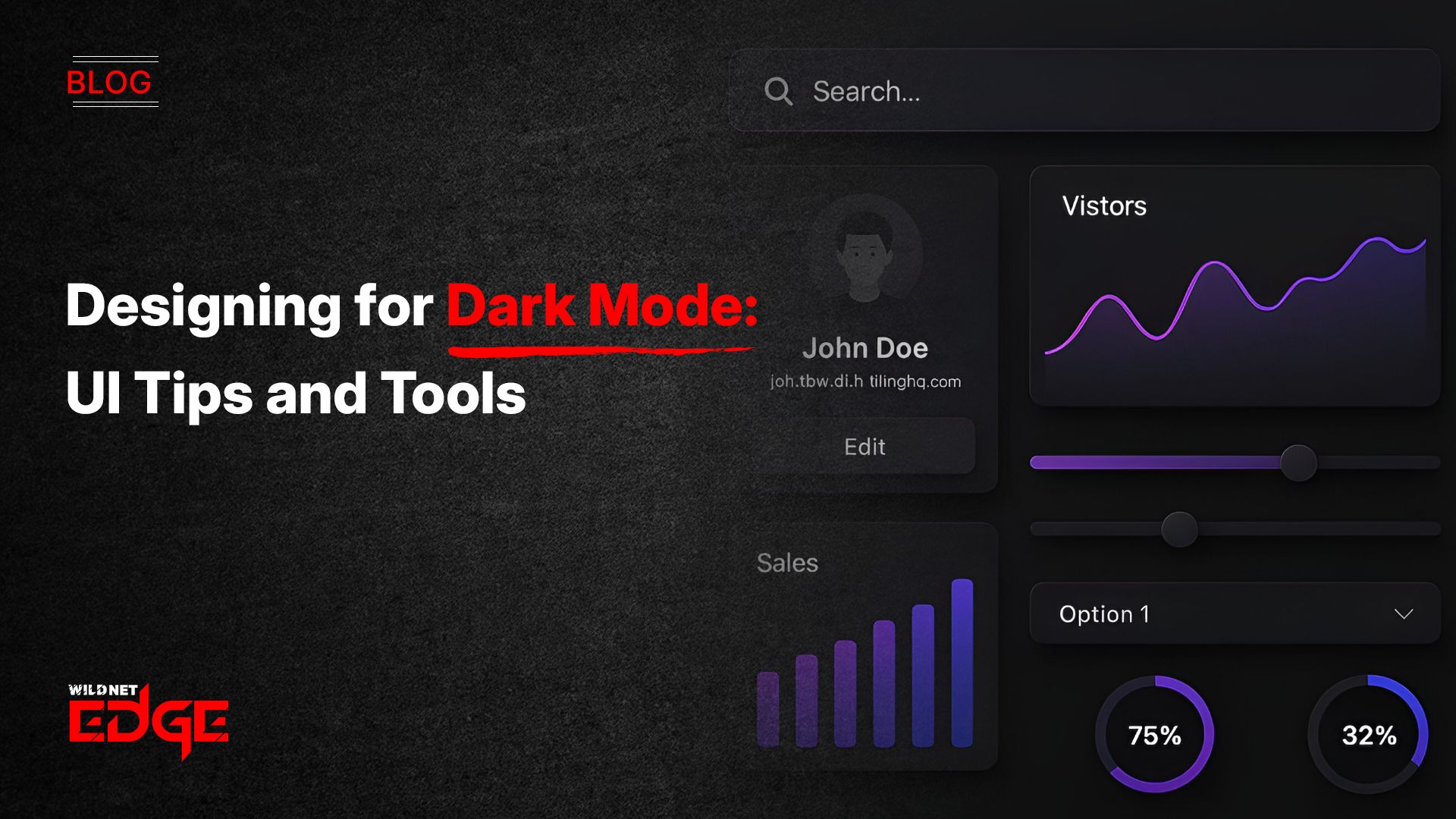
Struggling to make your app or website look sleek without sacrificing readability? Dark Mode UI is more than just a trend — it’s a necessity for modern digital design. Users now expect interfaces that not only reduce eye strain in low-light environments but also conserve device battery life. However, designing a dark interface that’s both visually appealing and accessible isn’t always straightforward. Poor color choices can cause glare, reduce readability, or alienate users with visual impairments.
In this guide, you’ll learn practical tips and tools for crafting dark mode experiences that use smart color palettes and embrace accessibility standards. This approach ensures your UI looks great and works for everyone, from casual users to those relying on assistive technologies.
Understanding Color Palettes for Dark Mode UI
When designing a Dark Mode UI, choosing the right color palette is crucial for maintaining clear communication and usability. Unlike light themes, dark backgrounds demand a different approach because colors appear differently, and contrast is king.
- Contrast Ratios and Their Role in Readability
Contrast ratio defines the difference between text (or UI elements) and the background. For dark mode, this ratio must be sufficiently high to provide clear distinction without overwhelming the eyes. WCAG recommends a minimum contrast ratio of 4.5:1 for normal text and 3:1 for large texts. Achieving this on dark backgrounds requires careful selection and testing. - Choosing Primary and Accent Colors that Pop on Dark Backgrounds
Primary colors in dark mode often appear muted if overly saturated. Instead, designers should select muted, desaturated primary hues paired with bright, intentionally saturated accent colors. For example, a dark gray (#121212) background combined with a muted blue (#3A7BD5) and a vibrant accent like coral (#FF6F61) creates a visually engaging and balanced interface. - Avoiding Oversaturation and Glare
Overly bright colors on dark backgrounds can produce glare that strains the eyes during extended use. This often happens when pure whites or neon colors are used as text or highlights. Instead, soft whites (#E0E0E0) or light grays (#B0B0B0) should be used for text, while accent colors should be chosen thoughtfully to ensure they enhance rather than distract. - Tools for Testing and Generating Dark Mode Color Palettes
Several 2025 tools streamline palette creation and verification:- Coolors: Allows users to generate palettes specifically for dark backgrounds, with adjustable contrast settings.
- Adobe Color: Offers a dark mode preview mode and color blindness simulation features.
- Contrast Checker by WebAIM: Ensures color combinations meet WCAG standards for dark UI by calculating contrast ratios instantly.
Pro Tip: Always test your dark mode color palettes on multiple displays (OLED, LCD, etc.) because color rendering and brightness levels vary widely.
Accessibility Considerations in Dark Mode Design
Accessibility in Dark Mode UI design is essential not only for compliance but to ensure your product reaches all users effectively. Dark themes can pose unique challenges but are an opportunity to enhance inclusivity.
- WCAG Guidelines Related to Color Contrast for Dark UIs
The Web Content Accessibility Guidelines (WCAG) v2.2 emphasize contrast and legibility, which dark mode must prioritize. For example, text and interactive elements should have a contrast ratio of at least 4.5:1 against the dark background. Use semantic HTML and ARIA roles to assist screen readers regardless of color usage. - Tips for Ensuring Text Legibility and Interactive Element Visibility
Text should never be purely white on pure black; instead, use off-white shades to reduce visual fatigue. Interactive elements like buttons require distinct borders or shadows to stand out without excessive brightness. Hover and focus states should be clearly indicated with subtle brightness shifts or color changes that comply with contrast standards. - Common Pitfalls like Insufficient Contrast and Color Blindness Issues
Low contrast text or icons are common pitfalls in dark mode UI, especially when designers try to create “soft” looks but reduce legibility instead. Also, color blindness simulation is critical. Red-green blindness can make some accent colors indistinguishable on dark backgrounds unless alternative cues like patterns or icons are used. - Using Tools to Simulate Accessibility Scenarios
Utilize these in 2025 to ensure your dark mode is accessible:- Stark: Integrates into design platforms like Figma and Sketch for real-time color blindness simulations and contrast checks.
- Axe Accessibility Checker: A browser extension that audits your dark mode UI for accessibility issues dynamically.
- Color Oracle: A standalone app that simulates various types of color blindness for desktop.
Actionable Tip: Always combine color with other indicators like shape or texture to communicate status or alerts, ensuring users with color vision deficiencies can navigate comfortably.
Tools and Resources for Designing Dark Mode UI
Streamlining your dark mode UI workflow requires using the right modern tools that cater to both design aesthetics and accessibility. Here are the top tool categories to boost your 2025 design process:
- Palette Generators Tailored for Dark Mode
- Coolors: Enables creating harmonious dark mode palettes quickly, with toggles for vibrancy and contrast adjustments.
- Adobe Color: Incorporates accessibility checking along with dark mode previews to tailor palettes effectively.
- Accessibility Checkers and Contrast Analyzers
- Stark: Integrates directly into popular design tools to check color contrast and simulate disabilities without leaving your workspace.
- Axe: Offers automated scanning to detect accessibility pitfalls before deployment.
- UI Frameworks and Libraries Supporting Dark Theme Components
- Material UI (MUI): Offers first-class support for dark themes with customizable palette options and accessible components out-of-the-box.
- Tailwind CSS: Provides utility classes to quickly implement dark mode with controlled color choices that can be audited for contrast.
- Ant Design: Includes extensive dark theme presets and documentation focusing on accessibility.
- Examples of Successful Dark Mode UI Implementations
- Apple iOS and macOS: Well-balanced dark themes with subtle textures and effective use of translucency to maintain visual hierarchy.
- GitHub Dark Mode: Uses precise contrast and color cues to separate content clearly while maintaining a calming aesthetic for developers.
- Notion: Balances muted tones with functional accents and thorough accessibility adaptations, making content easy to read and navigate in dark mode.
Leverage these tools and references to refine your dark mode color palettes and increase accessibility compliance, saving time and improving product quality.
Emerging Trends and Advanced Tips for Dark Mode UI
Dark mode design is evolving rapidly. The future points toward smarter, more adaptive, and user-centric dark UI that enhances experience dynamically.
- Dynamic or Adaptive Color Palettes Based on Environment or Time
Rather than a fixed dark color scheme, adaptive palettes shift subtly depending on ambient light or user preferences. This reduces eye strain further by automatically adjusting contrast and hue. APIs in 2025 allow devices to push environmental data to apps, enabling these smart palettes. - Incorporating User-Toggle Options with Seamless Transitions
Allowing users to switch between light and dark modes with smooth animations enhances usability and satisfaction. Tools like CSS variables and JS frameworks facilitate these toggles while managing accessible color updates without flashing or flickering. - Optimizing Performance and Battery Life with Dark Mode UI
Beyond aesthetics, dark mode can save power on OLED screens by avoiding white-heavy backgrounds. Designers should minimize bright gradients and use pure blacks selectively. Additionally, image assets should have dark variants to avoid clashing or unnecessary brightness spikes. - Designing for Multi-Device Consistency and Responsiveness
With diverse devices — smartphones, tablets, desktops — dark mode designs must remain consistent yet adaptable. Responsive typography, scalable contrast adjustments, and flexible palettes ensure the UI feels native on every screen and lighting condition.
Advanced Tip: Integrate dark mode preferences with system-level settings to provide a frictionless experience, respecting privacy and user autonomy.
Conclusion
Mastering Dark Mode UI design means balancing aesthetics with functionality — especially when it comes to color palettes and accessibility. It’s about creating interfaces that are visually elegant, reduce eye fatigue, and are inclusive to all users regardless of ability or environment.
By applying the tips shared in this guide and leveraging best-in-class tools, you ensure your dark mode interfaces perform beautifully and meet modern digital standards. When you’re ready to elevate your dark mode experience, trust WildnetEdge’s expertise to guide your design and development process to new heights. Start creating dark mode designs that truly shine today.
FAQs
Q1: What are the best color palettes for Dark Mode UI design?
The best palettes employ high-contrast, muted tones with carefully selected accent colors. They minimize eye strain and maintain readability by balancing brightness and saturation appropriately for dark backgrounds.
Q2: How can I ensure accessibility in Dark Mode UI?
Follow WCAG contrast guidelines strictly. Avoid low-contrast text, test your design with color blindness simulators like Stark or Color Oracle, and verify your UI with accessibility tools such as Axe to address any deficiencies.
Q3: Are there tools specifically for designing accessible Dark Mode UIs?
Yes. Tools such as Stark, Axe, Adobe Color, and Coolors provide palette generation and accessibility checks tailored for dark mode environments, integrating accessibility into every step of design.
Q4: How does Dark Mode UI affect user experience?
When designed effectively, dark mode reduces eye strain in dim conditions, can extend battery life on OLED and AMOLED devices, and delivers a modern, sophisticated look that enhances overall usability.
Q5: Can users customize Dark Mode UI color palettes?
Advanced designs enable user customization through adaptive palettes or toggle options, allowing the interface to adjust based on personal preferences or ambient lighting, enhancing comfort and personalization.

Managing Director (MD) Nitin Agarwal is a veteran in custom software development. He is fascinated by how software can turn ideas into real-world solutions. With extensive experience designing scalable and efficient systems, he focuses on creating software that delivers tangible results. Nitin enjoys exploring emerging technologies, taking on challenging projects, and mentoring teams to bring ideas to life. He believes that good software is not just about code; it’s about understanding problems and creating value for users. For him, great software combines thoughtful design, clever engineering, and a clear understanding of the problems it’s meant to solve.


 based on 1200+ reviews


