TL;DR
Data Visualization helps businesses make faster, better decisions by turning complex data into clear visuals. With the right analytics dashboards and BI visualization tools, teams reduce confusion, spot trends early, and act with confidence. Strong data storytelling and visual data insights improve alignment across teams and turn data into action.
In 2026, most businesses don’t have a data problem. They have a clarity problem. Teams collect massive amounts of data every day—sales numbers, customer behavior, operations metrics but struggle to turn it into decisions. Long spreadsheets and static reports slow teams down. Meetings drag on because no one can clearly see what’s happening.
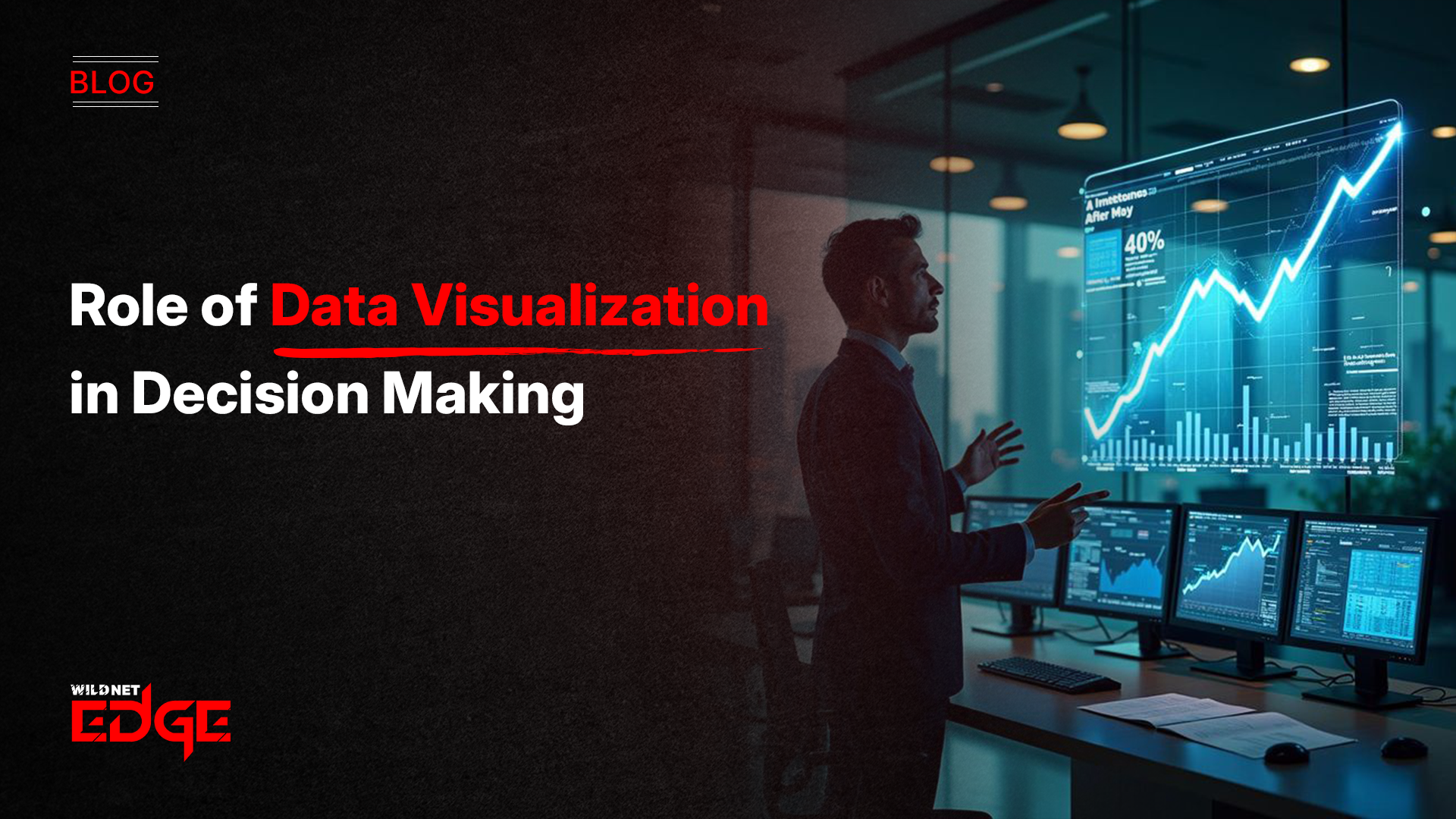
This is where Data Visualization plays a critical role. It turns raw numbers into clear visuals that people can understand quickly. Charts, graphs, and dashboards help teams spot trends, risks, and opportunities without digging through rows of data.
This article explains how visualizing data improves decision-making, why analytics dashboards and business intelligence visuals matter, how data storytelling influences leadership decisions, and how companies can use the right BI visualization tools to uncover real visual data insights.
The Science of Sight: Why It Works
People process visuals far faster than text or numbers. That’s not a trend, it’s how the brain works.
Seeing Patterns Instantly
When you look at a chart, you immediately notice spikes, drops, and outliers. You don’t need to calculate or analyze first. Data Visualization uses color, size, and position to highlight what matters most.
This speed matters when leaders need to make decisions quickly—whether it’s spotting a sales dip, a supply chain issue, or a performance bottleneck.
Reducing Mental Overload
Spreadsheets demand effort. Dashboards reduce it.
A well-designed analytics dashboard shows what’s healthy, what’s risky, and what needs attention often in seconds. By lowering the effort required to understand data, the visualization of data frees leaders to focus on decisions instead of interpretation.
The Foundation: Data Quality and Preparation
A beautiful chart based on bad data is a dangerous lie.
Garbage In, Garbage Out
Before any visualization occurs, the underlying data must be rigorous. This involves cleaning, normalizing, and structuring the datasets. If the currency fields are mixed or the timestamps are unaligned, the visualization will be misleading. Partnering with a specialized data analytics company is often the first step to ensuring your data pipeline is robust enough to support high-fidelity visualizations.
Data Modeling for Visuals
There is no such thing as data structures that are visualization-ready. Fast performance in Data Visualization makes it necessary to use particular aggregations and dimensional modeling (like Star Schemas). In the backend, you have to do analytics for year-over-year growth or customer retention rate, so the visualization tool can display them instantly without any delay.
Analytics Dashboards: How Businesses Monitor Reality
Dashboards are where Data Visualization becomes actionable.
Different Dashboards for Different Roles
- Strategic dashboards give executives a high-level view of revenue, growth, and performance.
- Operational dashboards help managers track daily metrics like inventory levels or support queues.
- Analytical dashboards allow deeper exploration to understand root causes.
Each dashboard serves a different decision but all rely on clear business intelligence visuals.
Real-Time Visibility
Static reports age quickly. Live analytics dashboards update automatically as new data flows in. This real-time view helps teams respond immediately before small issues become major problems.
Selecting the Right Tools
The market is flooded with software. Choosing the right stack is crucial.
BI Visualization Tools
Leaders like Tableau, Power BI, and Looker dominate the space.
- Tableau: Known for its stunning visuals and deep analytical capabilities.
- Power BI: Excellent for organizations deeply integrated into the Microsoft ecosystem.
- Looker: Great for data governance and embedding visuals into other applications. Selecting the right BI visualization tools depends on your user base, budget, and technical maturity. Utilizing professional BI services can help you navigate this selection process and configure the tools for maximum impact.
Custom vs. Off-the-Shelf
At times, plain tools are insufficient. For example, custom development with libraries like D3.js or Recharts might be the case for customer-oriented platforms or very particular functions. To your company and product needs, bespoke Visualization of data experiences are being developed thus uninterrupted branding through visualization of data.
The Art of Dashboard Design
Design is not decoration; it is function.
The 5-Second Rule
A user should be able to understand the key message of a dashboard within five seconds. If they have to ask, “What does this axis mean?”, the design has failed. Effective dashboard development prioritizes clarity over complexity. It avoids “chart junk” (unnecessary 3D effects, shadows) and focuses on the data-ink ratio.
Context and Comparison
A number in isolation (e.g., “$5M Revenue”) is meaningless. Is that good? Bad? Data Visualization provides context. It compares the number to a target, to the previous year, or to a competitor benchmark. Expert dashboard development ensures that every metric is presented with the necessary context to drive a decision.
Data Storytelling: Influencing the Narrative
Data doesn’t speak for itself; it needs a narrator.
The Narrative Arc
Data storytelling is the skill of combining data, visuals, and narrative to communicate a specific insight. Instead of just showing a bar chart of falling sales, a data story would show the trend, annotate the specific event that caused the drop (e.g., a supply chain disruption), and highlight the recovery path.
Persuasion through Visuals
When you need to convince a Board of Directors to approve a budget, a spreadsheet won’t work. A compelling Data Visualization that clearly shows the projected ROI and the cost of inaction is a persuasion tool. It aligns stakeholders around a single version of the truth, reducing debate over the numbers and focusing the conversation on the strategy.
Visual Data Insights for Discovery
Visualization isn’t just for reporting; it’s for exploration.
Finding the “Unknown Unknowns”
Machine learning algorithms are very efficient at uncovering the patterns they are specifically trained to recognize. Visualization of data gives the opportunity for humans to identify the patterns they had no idea were there. An analyst, for instance, might come across a relationship between the weather and returns that had not been anticipated by any model by interactively filtering and drilling into the data. Such visual data insights can lead to innovations and new product ideas.
Geospatial Analysis
Maps have always been regarded as among the most impactful ways of Data Visualization. For retail or logistics, data visualized on a map shows density clusters and coverage gaps. It provides answers to questions like “Where is the best site for the next store?” or “Which delivery routes are not economical?”
Democratizing Data
The ultimate goal is to put data in everyone’s hands.
Self-Service BI
Modern Visualization of data platforms empowers non-technical users to create their own reports. This “Self-Service BI” model removes the bottleneck of the IT department. A marketing manager can drag-and-drop fields to answer their own questions, fostering a culture of curiosity and agility.
Mobile Access
Decisions happen everywhere, not just at a desk. Business intelligence visuals must be responsive, rendering correctly on tablets and smartphones. This allows a factory floor manager to check production stats while walking the line, or a sales VP to check pipeline health while at the airport.
Case Studies: Clarity in Action
Real-world examples illustrate the transformative power of the visualization of data.
Case Study 1: Supply Chain Visibility
- The Challenge: A global manufacturer had no visibility into inventory levels across its 50 warehouses. They were overstocking in some regions and running out in others.
- Our Solution: We implemented a centralized Data Visualization control tower using Power BI.
- The Result: The dashboard provided real-time global inventory views. Inventory holding costs dropped by 20%, and on-time delivery rates improved by 15% because managers could visually spot and balance stock levels.
Case Study 2: Healthcare Patient Outcomes
- The Challenge: A hospital network wanted to reduce patient readmission rates. The data existed in disparate EMR systems.
- Our Solution: We built an analytical dashboard that visualized patient journeys and highlighted risk factors.
- The Result: By using visual data insights, doctors identified a specific correlation between medication timing and readmission. Adjusting the protocol reduced readmissions by 12%, improving patient care and reducing penalties.
What’s Next for Data Visualization
The future of the visualization of data is becoming more intuitive and immersive.
- AI will generate visuals automatically from questions.
- AR and VR will allow teams to interact with data in new ways.
- Natural language queries will lower the barrier to insights even further.
These advances will make visualization of data even more central to decision-making.
Conclusion
In a world full of data, clarity is the real advantage. Data Visualization turns information into understanding. It helps leaders see problems early, align teams faster, and act with confidence. When combined with strong analytics dashboards, effective data storytelling, and the right BI visualization tools, businesses move from guessing to knowing. At Wildnet Edge, we help organizations design visual systems that don’t just look good; they drive better decisions, every day.
FAQs
Visualization of data is important because the human brain processes visuals much faster than text or numbers. It allows decision-makers to grasp complex concepts, identify trends, and spot outliers instantly, leading to faster and more accurate strategic decisions.
Reporting typically involves static tables and numbers (e.g., a PDF financial statement). Visualization of data involves dynamic, interactive graphical representations (e.g., a live dashboard) that allow users to explore the data, filter it, and derive insights rather than just reading facts.
The market leaders are Tableau, Microsoft Power BI, and Looker. The “best” tool depends on your specific needs: Power BI is great for Microsoft shops, Tableau offers superior design flexibility, and Looker is excellent for data modeling and governance.
To avoid misleading Visualization of data, ensure you use appropriate scales (start axes at zero where possible), avoid distorting aspect ratios, and choose the right chart type for the data (e.g., don’t use a pie chart for 20 categories). Context is key.
Yes. Modern analytics dashboards are connected to live data sources via APIs. Once the dashboard is built, the Visualization of data updates automatically in real-time as new data flows in, eliminating the need for manual report generation.
Data storytelling is the practice of building a narrative around a set of data and its accompanying visuals. It contextualizes the visual data insights, explaining the “why” and “so what” to the audience to influence their understanding and actions.
Absolutely. Small businesses generate data too (sales, website traffic, expenses). Simple Visualization of data tools (even inside Excel or Google Sheets) can help small business owners track cash flow trends and customer behavior to make better growth decisions.

Managing Director (MD) Nitin Agarwal is a veteran in custom software development. He is fascinated by how software can turn ideas into real-world solutions. With extensive experience designing scalable and efficient systems, he focuses on creating software that delivers tangible results. Nitin enjoys exploring emerging technologies, taking on challenging projects, and mentoring teams to bring ideas to life. He believes that good software is not just about code; it’s about understanding problems and creating value for users. For him, great software combines thoughtful design, clever engineering, and a clear understanding of the problems it’s meant to solve.
 sales@wildnetedge.com
 +1 (212) 901 8616
 +1 (437) 225-7733






 ChatGPT Development & Enablement
 Hire AI & ChatGPT Experts
 ChatGPT Apps by Industry
 ChatGPT Blog
 ChatGPT Case study
 AI Development Services
 Industry AI Solutions
 AI Consulting & Research
 Automation & Intelligence