sales@wildnetedge.com
 +1 (212) 901 8616
 +1 (437) 225-7733


 ChatGPT Development & Enablement
  Hire AI & ChatGPT Experts
  ChatGPT Apps by Industry
  ChatGPT Blog
  ChatGPT Case study
  AI Development Services
  Industry AI Solutions
  AI Consulting & Research
  Automation & Intelligence


Ever felt stuck managing design inconsistencies across your product teams? If your UI elements keep changing and dev handoffs are a mess, it’s time to rethink your approach. That’s where a UI Design System comes in—it’s more than just a style guide; it’s your secret weapon to scaling design efficiently with reusable UI components that ensure consistency and speed up collaboration. In this post, we’ll break down how mastering a UI Design System transforms your product design and development workflow for good.
What is a UI Design System and Why It Matters
A UI Design System is a comprehensive collection of reusable components, guided by clear standards and principles, that unifies product design and development. Unlike a typical style guide or pattern library, which may only document colors, typography, or UI patterns separately, a design system integrates every design and code asset into a central framework. This provides a single source of truth that aligns designers and developers on every aspect of the interface.
How does a UI Design System differ from pattern libraries and style guides?
- Pattern libraries focus on cataloging UI elements but often lack the contextual guidance or code integration needed for implementation.
- Style guides document visual styles but rarely provide reusable components or workflow integration.
- Design systems combine the best of both while adding rules, behaviors, and scalable frameworks for product teams.
Why does this matter? Because modern digital products demand consistency at scale. As teams grow and products evolve, relying on scattered, loosely managed UI assets results in slow iterations, fragmented user experiences, and wasted resources. A design system anchors the entire product in cohesive design principles and reusable code.
Impact on product teams’ efficiency and quality:
- Faster decision-making: Designers reuse components instead of reinventing the wheel.
- Reduced errors: Developers implement trusted components rather than custom builds prone to bugs.
- Improved user experience: Consistency across platforms and releases increases familiarity and usability.
- Better scalability: Teams can ramp up quickly without sacrificing quality, crucial for accelerating product roadmaps.
Ultimately, a UI Design System is the foundation that converts fragmented design efforts into a unified, scalable operation driving product excellence.
Leveraging Reusable UI Components for Design Scalability
At the heart of every UI Design System are reusable UI components. These are pre-built, standardized building blocks such as buttons, input fields, form elements, navigation menus, and cards that can be used throughout a product or across multiple products.
What are reusable UI components?
They are self-contained, customizable UI pieces coded to be reused with minimal changes. Instead of creating each element from scratch, teams plug these components into designs and codebases, enabling rapid prototyping and iteration.
Benefits of reusable UI components include:
- Consistency: Visually and functionally uniform interfaces that build user trust.
- Faster prototyping: Designers can assemble interfaces swiftly to validate ideas.
- Easier maintenance: Updates to a component propagate globally, avoiding tedious fixes.
- Cross-platform scalability: Components adapt for web, mobile, or desktop, preserving brand identity.
Consider common reusable components like standard buttons with defined hover states, form fields with validation feedback, or top navigation bars. When these are documented and implemented consistently, they become the backbone of a scalable design ecosystem.
How do these components promote design scalability across platforms and teams?
- By abstracting UI elements into modular components, teams avoid duplicated efforts.
- Developers can build faster by reusing code components, reducing bugs tied to custom solutions.
- Designers maintain brand integrity by relying on a controlled component library.
- Changes in user needs or business goals only require updating components once, then deploying universally.
In 2025 and beyond, reusable UI components continue evolving with smart automation and AI integration, but their core value remains: enabling design scalability and efficient collaboration at every stage of product development.
Streamlining Product Design & Development Collaboration
One of the most powerful advantages of adopting a UI Design System is how it bridges the longstanding gap between designers and developers. Traditionally, design handoffs suffered from miscommunications and competing priorities, leading to costly delays and inconsistent user interfaces.
How does a UI Design System foster closer cooperation?
- Shared language and assets: Designers and developers work from the same component libraries and design tokens, minimizing ambiguity.
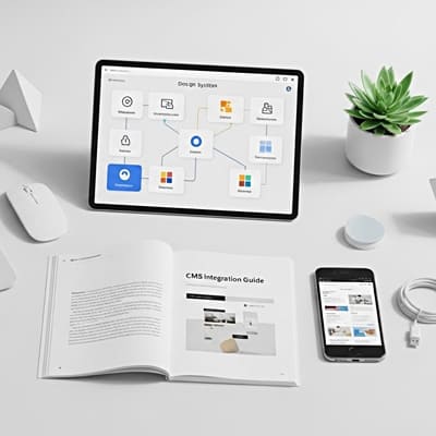
- Integrated tooling: Platforms like Figma allow design teams to create and share components with metadata that developers can consume directly. On the development side, tools like Storybook enable building, testing, and documenting UI components in isolation.
- Design tokens management: Centralizing colors, spacing, and typography as tokens ensures that any adjustment reflects across design and code synchronously.
- Version control & feedback: Shared design systems promote iterative improvements using real-time collaboration and versioning within both design and code environments.
Implementing these best practices results in more predictable project timelines and smoother communications. When everyone speaks the same “component language,” design intent perfectly translates into development.
Real-world impact:
- Engineering teams resolve ambiguities faster, reducing missed requirements.
- Designers reduce repetitive tasks, focusing on crafting better user experiences.
- Cross-functional teams deliver features with fewer bugs and less rework.
- Stakeholders see quicker time-to-market and higher quality products.
These collaborative improvements are vital for agile workflows and for teams scaling from startup stages to enterprise-grade product portfolios.
Advanced Trends and Best Practices in UI Design Systems
As UI Design Systems mature, advanced techniques and emerging trends redefine how teams build and manage them.
Automation and AI in component generation
Cutting-edge tools now leverage AI to generate preliminary UI components or suggest design improvements based on data-driven patterns. Automation also supports bulk refactoring, accessibility checks, and auto-updates minimizing manual bottlenecks.
Accessibility baked into components
Focus on inclusive design is non-negotiable. Leading design systems embed accessibility standards—like WCAG compliance—directly into component behavior, ensuring components are usable by all users without extra developer effort.
Continuous integration with development workflows
Modern UI Design Systems integrate seamlessly with dev pipelines, using continuous integration/continuous deployment (CI/CD) to automatically sync component updates between design and codebases. This reduces version drift and improves delivery velocity.
Balancing customization vs. standardization
While standard components drive consistency, flexibility is critical. Best practices involve offering variants and configurable properties to accommodate unique cases without breaking the system’s integrity.
Measuring ROI of design scalability
Teams increasingly track KPIs such as reduced time-to-market, fewer bugs, higher user retention, and improved brand consistency to quantify the impact of design systems on business outcomes. Data-driven refinement cycles reinforce the system’s value and encourage ongoing investment.
By adopting these trends and continuously evolving their UI Design Systems, organizations safeguard their design scalability against future challenges and ensure resilient, high-quality product ecosystems.
Conclusion
A well-executed UI Design System powered by reusable UI components is the key to scalable, efficient product design and development collaboration. By implementing these systems thoughtfully, your team can reduce inconsistencies, speed up delivery, and improve user experience across all platforms. The synergy between design and development created by shared components and integrated workflows elevates quality and accelerates innovation.
When it comes to expert guidance and seamless integration of scalable UI Design Systems, WildnetEdge stands out as a trusted partner. Leveraging cutting-edge tools and best practices, WildnetEdge helps teams adopt, customize, and optimize UI Design Systems tailored to their unique business goals. Ready to elevate your design process? Partner with WildnetEdge and start building smarter today.
FAQs
Q1: What is the main benefit of using a UI Design System?
A1: A UI Design System ensures consistency and scalability by providing reusable UI components and clear guidelines that streamline design and development workflows.
Q2: How do reusable UI components improve design scalability?
A2: Reusable components allow teams to build interfaces quickly without starting from scratch, maintaining uniformity across products and simplifying updates.
Q3: Can a UI Design System help improve collaboration between designers and developers?
A3: Yes, it creates a shared language and resource library that ensures design intent is clearly communicated and implemented effectively by developers.
Q4: What tools support building and maintaining UI Design Systems?
A4: Popular tools include Figma for design collaboration, Storybook for component development, and design token managers that keep styles consistent.
Q5: How does WildnetEdge assist with UI Design System implementation?
A5: WildnetEdge offers expert consulting and integration services to help teams adopt scalable UI Design Systems tailored to their unique workflows and business goals.

Managing Director (MD) Nitin Agarwal is a veteran in custom software development. He is fascinated by how software can turn ideas into real-world solutions. With extensive experience designing scalable and efficient systems, he focuses on creating software that delivers tangible results. Nitin enjoys exploring emerging technologies, taking on challenging projects, and mentoring teams to bring ideas to life. He believes that good software is not just about code; it’s about understanding problems and creating value for users. For him, great software combines thoughtful design, clever engineering, and a clear understanding of the problems it’s meant to solve.


 based on 1200+ reviews


