sales@wildnetedge.com
 +1 (212) 901 8616
 +1 (437) 225-7733


 ChatGPT Development & Enablement
  Hire AI & ChatGPT Experts
  ChatGPT Apps by Industry
  ChatGPT Blog
  ChatGPT Case study
  AI Development Services
  Industry AI Solutions
  AI Consulting & Research
  Automation & Intelligence


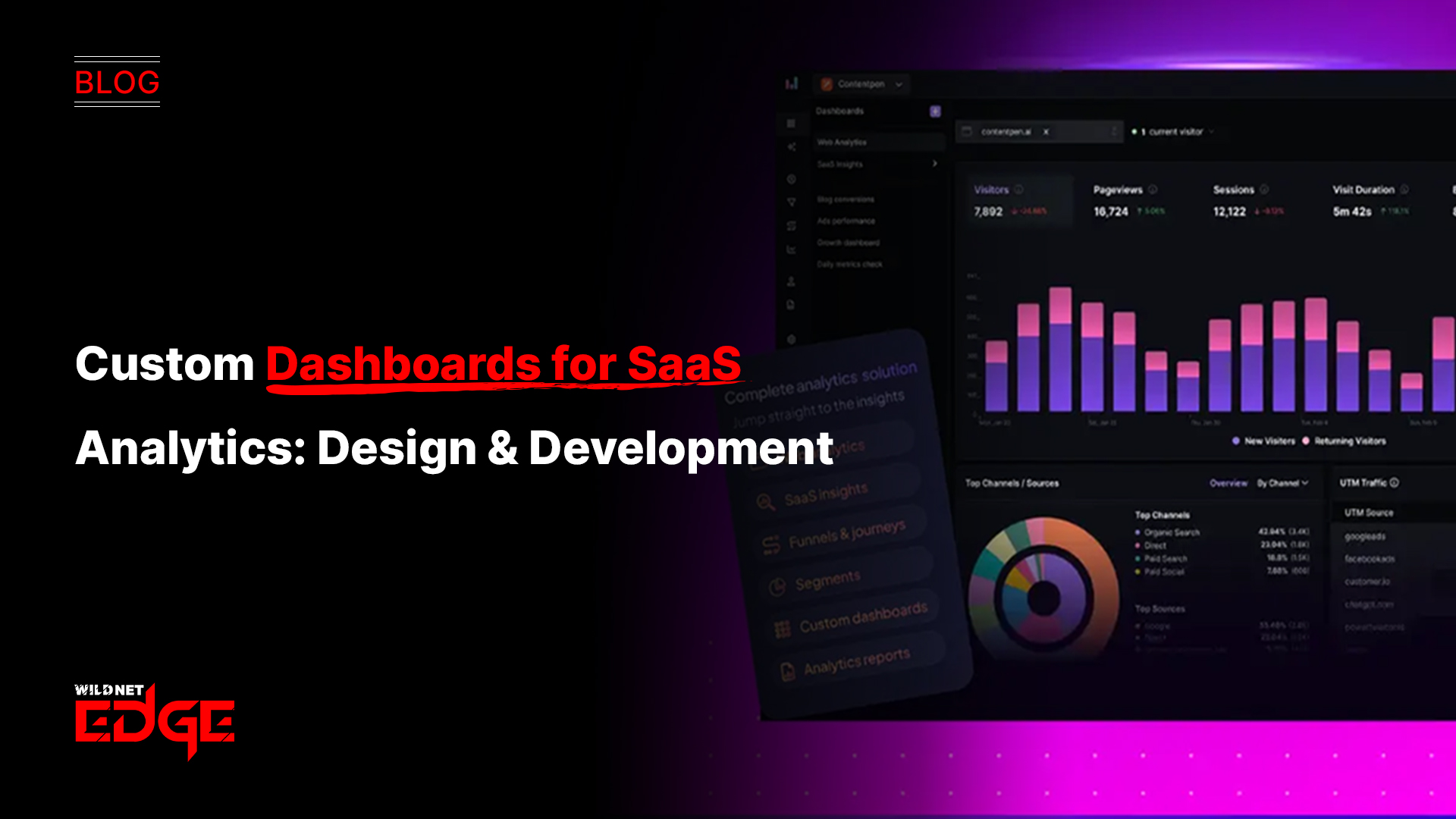

Are you struggling to make sense of your SaaS product’s data? You’re not alone. Without a clear view of key performance indicators and usage metrics, making informed decisions feels like guesswork. That’s where custom SaaS dashboards come in — designed to bring your analytics into sharp focus so you can optimize growth and user engagement. In today’s data-driven landscape, a well-crafted SaaS dashboard is more than just a reporting tool; it’s a strategic asset that empowers teams to act decisively.
Let’s dive into how you can design and develop dashboards that actually work, enabling precise KPI visualization and comprehensive monitoring of usage metrics to elevate your SaaS analytics.
Understanding KPI Visualization in SaaS Dashboards
Key Performance Indicator (KPI) visualization is the backbone of any effective SaaS dashboard. SaaS businesses operate in a highly competitive environment where performance metrics change rapidly. A dashboard that visualizes KPIs clearly enables stakeholders—from executives to product managers—to quickly grasp how the business is performing and where attention is needed.
Defining KPIs Relevant to SaaS
Certain KPIs stand out as crucial metrics to monitor in SaaS environments, including:
- Monthly Recurring Revenue (MRR): The lifeblood of subscription businesses, reflecting predictable income.
- Churn Rate: The percentage of customers leaving your service, critical for understanding retention.
- Customer Lifetime Value (LTV): The long-term revenue derived from a single customer, guiding marketing spend.
- Customer Acquisition Cost (CAC): How much is spent to acquire each new user.
- Net Promoter Score (NPS): Measures customer satisfaction and loyalty.
Tracking these alongside more granular product or user metrics gives a holistic picture.
Importance of Clear Visual Representation
The strength of KPI visualization lies in turning complex data sets into digestible visuals—charts, line graphs, gauges, and heat maps—to reveal trends and anomalies instantly. For example:
- Line graphs for tracking MRR growth over time.
- Bar charts for comparing churn rates monthly.
- Pie charts to segment user demographics or revenue sources.
- Heat maps to identify feature usage intensity.
Clear visuals reduce cognitive load, helping everyone—from C-suite to customer success teams—detect performance issues or opportunities at a glance.
Common Challenges in KPI Visualization and How to Avoid Them
Many SaaS dashboards suffer because they:
- Show too much data: Overloading dashboards leads to analysis paralysis; focus on actionable KPIs.
- Use inconsistent scales or metrics: Mismatched units or unclear labeling confuse users.
- Ignore context: KPIs without historical or benchmark comparisons lack meaning.
Tips to overcome these challenges:
- Prioritize the most impactful KPIs relevant to user roles.
- Ensure consistent formatting and labeling across widgets.
- Include contextual benchmarks or targets alongside actual data.
- Use interactive elements so users can drill down for detail without clutter.
Effective KPI visualization fuels better decision-making by helping teams focus on the winning metrics.
Tracking Usage Metrics for SaaS Product Analytics
While KPIs provide the “what” of business outcomes, usage metrics reveal the “why” behind customer behavior and product adoption. Tracking these allows SaaS companies to fine-tune features, enhance onboarding, and ultimately boost engagement.
Types of Usage Metrics to Track
Key usage metrics every SaaS dashboard should integrate include:
- Active Users: Daily or monthly active users (DAU/MAU) indicate engagement levels.
- Session Duration: Average time users spend in your app reveals stickiness.
- Feature Usage: Identifies which features are most and least used, driving prioritization.
- User Paths: Tracks common flows or drop-off points within the product.
- Retention Rate: Measures if users return over time, tying back to churn.
For example, a SaaS platform might notice a decline in session duration paired with decreased feature usage, signaling potentially confusing workflows.
Tools and Techniques for Collecting Accurate Usage Data
Collecting precise usage metrics requires tools capable of capturing interaction data at scale without affecting performance:
- Event-tracking platforms like Mixpanel, Amplitude, and Heap Analytics offer granular insights.
- Google Analytics 4 (GA4) enhanced with user-centric reporting is increasingly suitable for SaaS products.
- Custom API integrations enable centralized data warehousing, feeding clean input into dashboards.
- Data pipelines using ETL tools (e.g., Fivetran or Airbyte) ensure reliable syncs from multiple sources.
The right mix depends on your SaaS stack and team capacity but always emphasizes accuracy, minimal latency, and data hygiene.
How Usage Metrics Inform Product Improvements and Customer Success
Once you adopt systematic usage tracking, the insights gained power strategic actions:
- Feature prioritization: Invest in features with high adoption and expand or sunset underused ones.
- User onboarding optimization: Spot where new users disengage and enhance tutorials.
- Customer success targeting: Identify at-risk users (e.g., declining activity) to deliver proactive support.
- Pricing strategy: Correlate usage patterns with subscription tiers to refine offers.
In essence, usage metrics transform raw interactions into meaningful narratives that improve product-market fit and retention.
Designing Intuitive Custom Dashboards for SaaS Analytics
An intuitive dashboard amplifies the impact of KPI visualization and usage metrics by making insights easy to find and act on. Thoughtful design turns dashboards from passive data dumps into daily decision hubs.
Principles of Effective Dashboard Design
Focus on three core principles:
- Simplicity: Avoid clutter by limiting the number of widgets to the essentials. Use whitespace and typography to create a clean interface.
- Relevance: Customize dashboards to highlight metrics that matter most to the user’s role and goals.
- Interactivity: Allow users to filter data by date ranges, user segments, or drill into detailed views for deeper analysis.
Simplicity combined with purposeful interactivity encourages engagement and quicker insight discovery.
Layout and Widget Selection Tailored to SaaS Analytics Needs
When designing SaaS analytics dashboards:
- Place high-priority KPIs such as MRR and churn prominently at the top — these are the business health indicators.
- Use trend charts to show progression for metrics like LTV and active users over time.
- Integrate funnel visualizations illustrating conversion rates through onboarding steps or trial to paid.
- Incorporate usage heat maps or feature adoption graphs within user behavior sections.
Widgets should be visually distinct but harmonized in style and color to avoid sensory overload. Responsive designs ensure usability across devices.
Personalization Options for Different User Roles
A one-size-fits-all dashboard rarely meets the diverse SaaS team’s needs. Personalization helps deliver relevant insights efficiently:
- Executives: Focus on high-level KPIs with summarized financial and growth metrics.
- Product Managers: Emphasize usage metrics, feature engagement, and NPS data to guide roadmaps.
- Customer Success: Highlight churn risks, active user counts, and support ticket trends.
- Sales & Marketing: Monitor CAC, conversion funnels, and campaign performance.
Role-based access controls can tailor views and data permissions, ensuring each stakeholder sees only what’s relevant to their function.
Development Considerations for Scalable SaaS Dashboards
Building scalable SaaS dashboards is not just about design but also about technical robustness—ensuring they remain reliable, secure, and performant as usage grows.
Integration with Existing Data Sources and APIs
Most SaaS analytics require pulling data from multiple sources—CRMs, product databases, marketing platforms:
- Ensure your dashboard tool supports standard connectors and custom API integrations.
- Structure your data warehouse to consolidate events, transactions, and user profiles into unified schemas.
- Use ETL pipelines to automate data refreshes and maintain data integrity.
Choosing tools with robust API support like Looker, Power BI, or SaaS-specific platforms can simplify ingesting diverse data streams.
Real-Time Data Updating and Performance Optimization
Real-time or near-real-time dashboards offer competitive advantages, but require:
- Efficient querying with incremental loads rather than full database scans.
- Caching mechanisms to reduce repeated calculations.
- Scalable cloud infrastructures that handle spikes in data volume and concurrent users.
Balancing speed and cost, modern SaaS dashboards often leverage streaming data technologies (e.g., Apache Kafka) coupled with serverless architecture to minimize latency.
Security and Data Privacy Best Practices for SaaS Environments
Data security must be embedded in dashboard development:
- Implement role-based access controls (RBAC) ensuring users access only authorized data.
- Encrypt data in transit and at rest using industry standards like TLS and AES-256.
- Comply with regulations such as GDPR, CCPA, and HIPAA depending on customer location and data type.
- Monitor audits and logs to detect unauthorized access or anomalies.
Privacy-first analytics frameworks are becoming the standard as trust is paramount in SaaS client relationships.
Emerging Trends: AI-Driven Analytics and Predictive KPI Visualization
2025 ushers in AI-powered enhancements in SaaS dashboards:
- Predictive analytics to forecast metrics like churn risk or MRR growth using historical patterns.
- Natural language query interfaces allowing users to ask questions and get instant visualizations without manual filtering.
- Automated anomaly detection highlights unusual metric changes, flagging issues before they escalate.
Integrating machine learning models enhances decision-making agility and enriches KPI visualization with forward-looking insights.
Conclusion
Custom SaaS dashboards transform raw data into actionable insight, making KPI visualization and usage metrics integral to your analytics strategy. When built thoughtfully—balancing clear, personalized design with technical scalability and security—these dashboards empower your teams to drive growth and improve user engagement confidently.
Finding a partner experienced in tailoring SaaS analytics solutions can accelerate this journey. WildnetEdge stands out as a trusted authority, delivering proven expertise to help SaaS companies unlock the full potential of their data assets. Ready to elevate your SaaS analytics? Connect with WildnetEdge today and discover how your dashboards can become powerful decision engines.
FAQs
Q1: What are the key KPIs to include in SaaS dashboards?
Essential KPIs include Monthly Recurring Revenue (MRR), churn rate, Customer Lifetime Value (LTV), and customer acquisition costs. These metrics together provide a comprehensive snapshot of your SaaS business’s financial health and growth potential.
Q2: How can usage metrics improve SaaS product performance?
Usage metrics like active users, session length, and feature adoption reveal how customers interact with your product. These insights guide targeted feature improvements, optimize onboarding, and enhance retention—ultimately boosting product performance.
Q3: What features should a custom SaaS dashboard have for effective KPI visualization?
A robust dashboard should offer clear, easy-to-read graphs, customizable widgets tailored to the user’s role, role-based views for security and relevance, real-time data updates, and intuitive navigation that enables quick interpretation of complex data.
Q4: Which tools are best for developing SaaS dashboards with usage metrics integration?
Popular development tools include Tableau, Power BI, Looker, and SaaS-specific analytics platforms. These support API integrations, allowing seamless data import from diverse sources and flexible, scalable customization.
Q5: How important is data security in SaaS dashboards development?
Data security is critical. SaaS dashboards handle sensitive user data and business metrics. Implementing encryption, role-based access controls, and ensuring compliance with regulations like GDPR protects client data and maintains trust.

Managing Director (MD) Nitin Agarwal is a veteran in custom software development. He is fascinated by how software can turn ideas into real-world solutions. With extensive experience designing scalable and efficient systems, he focuses on creating software that delivers tangible results. Nitin enjoys exploring emerging technologies, taking on challenging projects, and mentoring teams to bring ideas to life. He believes that good software is not just about code; it’s about understanding problems and creating value for users. For him, great software combines thoughtful design, clever engineering, and a clear understanding of the problems it’s meant to solve.