sales@wildnetedge.com
 +1 (212) 901 8616
 +1 (437) 225-7733


 ChatGPT Development & Enablement
  Hire AI & ChatGPT Experts
  ChatGPT Apps by Industry
  ChatGPT Blog
  ChatGPT Case study
  AI Development Services
  Industry AI Solutions
  AI Consulting & Research
  Automation & Intelligence


Ever stared at an admin dashboard that felt like more of a cluttered mess than a helpful tool? Designing a modern Admin Dashboard UI isn’t just about aesthetics—it’s about giving users clear insights and control without the overwhelm. The right dashboard empowers teams to make smarter decisions quickly and confidently by presenting data and functions with clarity and precision.
In this post, we’ll break down what must-haves like analytics widgets and access control look like in 2025’s landscape. From user-friendly designs to advanced features, you’ll learn exactly what to include to create dashboards that truly transform how users interact with data and manage their workflows.
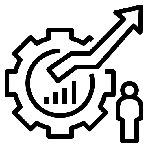
Analytics Widgets: Driving Data-Driven Decisions
Interactive analytics widgets are the heart of a modern Admin Dashboard UI. They transform raw numbers into visual stories that make data-driven decision-making immediate and intuitive.
Types of Analytics Widgets
- Charts and Graphs: Line charts, bar graphs, pie charts, and area charts visualize trends, comparisons, and distributions. In 2025, dynamic, real-time updating charts are the norm, enabling rapid analysis.
- KPIs (Key Performance Indicators): Summarize crucial metrics like revenue, user engagement, or system uptime with prominent counters or gauges. These provide at-a-glance insights.
- Heatmaps: Illustrate intensity or frequency in data, such as user clicks or traffic sources, providing spatial and temporal perspectives.
- Data Tables and Lists: Customizable data grids allow users to explore detailed records while enabling sorting, filtering, and inline editing.
Customization and Modular Design
Modern dashboards excel when users can personalize their workspace. Offering drag-and-drop modular widgets allows users to prioritize data relevant to their role. Customization options should include resizing widgets, choosing data sources, and setting refresh intervals.
For example, a marketing manager might highlight conversion funnels and campaign success metrics, while a sysadmin focuses on system health and error logs.
Impact on Decision-Making Speed and Accuracy
Analytics widgets accelerate decision-making by surfacing actionable insights instantly. Interactive elements let users drill down from high-level KPIs to granular data without switching screens.
Real-world business use cases show that dashboards with well-integrated analytics widgets reduce report turnaround times by up to 50%, enabling faster responses to market or operational shifts. They also minimize errors by visualizing complex datasets clearly, promoting confident actions rather than guesswork.
Actionable Tip: When designing analytics widgets, incorporate tooltip explanations and contextual links. This helps users understand metric definitions and take next steps without leaving the dashboard.
Access Control: Securing and Simplifying User Permissions
In any Admin Dashboard UI, balancing accessibility with security is essential. A robust access control system protects sensitive data and ensures users see only what’s relevant to their role.
Role-Based Access Control (RBAC) Basics
RBAC remains the foundational framework in 2025’s admin dashboards. It assigns permissions based on defined roles such as Admin, Manager, Editor, or Viewer. Each role has a specific set of privileges aligned with job functions.
For instance:
- Admins have full CRUD (Create, Read, Update, Delete) control over resources.
- Managers monitor analytics and approve workflows.
- Viewers can only read or export reports.
This setup streamlines permission management and enforces the principle of least privilege, minimizing the attack surface.
Importance of Granularity in Permissions
Modern systems demand fine-grained access control beyond broad role categories. Granularity ensures specific actions, data fields, or UI components have tailored restrictions, supporting complex organizational structures.
Examples of granular controls include:
- Limiting access to financial reports by department.
- Restricting editing capabilities on sensitive configuration settings.
- Enabling time-bound access for temporary team members.
Fine-tuning permissions reduces risk of data leaks and internal errors while fostering user trust.
Best Practices for Managing Multiple User Types and Compliance
- Automate Role Assignment: Integrate with single sign-on (SSO) providers and identity management systems to auto-assign roles based on HR data.
- Audit Trails: Maintain logs of user activities to support compliance with regulations like GDPR or HIPAA.
- User-Friendly Permission Settings: Offer intuitive UI tools that allow administrators to modify roles and permissions without code.
- Periodic Access Reviews: Regularly evaluate user roles to revoke unnecessary permissions, adapting to organizational changes.
Performance Recommendation: Use permission caching strategies to maintain system responsiveness without compromising security.
Intuitive UI Design for Usability and Efficiency
A powerful Admin Dashboard UI isn’t just about what’s included—it’s how information is presented. Intuitive design transforms complex data environments into streamlined user experiences.
Key Design Principles
- Consistency: Uniform button styles, icons, and interaction patterns across all modules reduce the learning curve and avoid confusion.
- Minimalism: Eliminate clutter by prioritizing essential data. Use whitespace strategically to create breathing room and prevent cognitive overload.
- Responsive Design: Dashboards must function seamlessly on desktops, tablets, and smartphones. Breakpoints and adaptive layouts cater to different screen sizes and input types.
Navigation Best Practices
Well-designed navigation accelerates task completion. Employ clear hierarchies with collapsible sidebars, breadcrumb trails, and search functionality. Quick access menus or favorites lists enhance efficiency for frequent actions.
Use of Color, Typography, and Spacing to Highlight Priorities
- Color: Use a restrained palette, reserving bold colors like red or orange for alerts or critical statuses. Blues and greens convey stability and success.
- Typography: Choose legible fonts with sufficient contrast. Vary font weights and sizes to differentiate headings, subheadings, and body text.
- Spacing: Adequate padding and margins help group related elements and separate distinct sections, making scanning easier.
Pro Tip: Employ accessibility standards such as WCAG 2.1 to ensure usability for all users, including those with visual impairments.
Advanced Features & Emerging Trends in Admin Dashboards
Admin dashboard capabilities are rapidly evolving. Staying ahead means integrating cutting-edge features that enhance functionality and user engagement.
Integration with AI and Predictive Analytics
In 2025, AI-powered analytics are indispensable. Dashboards leverage machine learning models to forecast trends, detect anomalies, and recommend actions.
Examples:
- Predicting sales dips and suggesting inventory adjustments.
- Automated anomaly detection in system metrics triggering alerts.
- Personalized data insights based on user behavior and preferences.
Real-Time Collaboration and Alerts
Collaboration tools embedded within dashboards improve teamwork. Shared notes, comment threads, and in-dashboard chat features let users discuss findings and coordinate actions instantly.
Real-time alerts notify teams of critical events via multiple channels such as SMS, email, or push notifications.
Mobile-Friendly Dashboards and Offline Capabilities
With remote work entrenched, mobile-optimized dashboards are vital. Adaptive interfaces ensure complex data remains comprehensible on small screens.
Offline capabilities—enabled by technologies like Progressive Web Apps (PWAs)—allow users to access key data and workflow functions even without internet connectivity.
Use of Progressive Disclosure to Manage Complex Data
Complex datasets can overwhelm users. Progressive disclosure techniques hide advanced options or details behind expandable menus or tabs, keeping the interface clean but still powerful.
This approach allows novice users to focus on essentials while power users delve deeper as needed.
Conclusion
Building an effective modern Admin Dashboard UI means blending powerful analytics widgets with robust access control, wrapped in an intuitive interface. This combination empowers users to stay informed, act securely, and work efficiently.
As dashboard expectations evolve, solutions like WildnetEdge stand out as trusted authorities offering cutting-edge platforms that bring these elements together seamlessly. Their expertise ensures your admin dashboard not only meets today’s standards but anticipates tomorrow’s challenges.
Ready to upgrade your admin dashboard and empower your users? Explore how WildnetEdge can help you elevate your UI today.
FAQs
Q1: What are essential analytics widgets to include in an Admin Dashboard UI?
Essential analytics widgets include line and bar charts, KPI counters, pie charts, and customizable data tables that provide real-time insights and help in data-driven decision making.
Q2: How can access control improve security in an Admin Dashboard UI?
Access control restricts sensitive data and functionality to authorized users only, minimizing security risks by implementing role-based permissions and granular user rights.
Q3: What best practices should I follow for designing an Admin Dashboard UI?
Focus on simplicity, consistency, responsive design, clear navigation, and using color and typography to guide user attention without overwhelming them.
Q4: How do real-time analytics widgets enhance dashboard functionality?
They provide instant data updates allowing users to monitor performance metrics and react promptly to changes or anomalies.
Q5: Can Admin Dashboards be customized for different user roles?
Yes, effective admin dashboards use access control to tailor views and features based on user roles, ensuring relevant data and controls are accessible to each user type.

Managing Director (MD) Nitin Agarwal is a veteran in custom software development. He is fascinated by how software can turn ideas into real-world solutions. With extensive experience designing scalable and efficient systems, he focuses on creating software that delivers tangible results. Nitin enjoys exploring emerging technologies, taking on challenging projects, and mentoring teams to bring ideas to life. He believes that good software is not just about code; it’s about understanding problems and creating value for users. For him, great software combines thoughtful design, clever engineering, and a clear understanding of the problems it’s meant to solve.