sales@wildnetedge.com
 +1 (212) 901 8616
 +1 (437) 225-7733


 ChatGPT Development & Enablement
  Hire AI & ChatGPT Experts
  ChatGPT Apps by Industry
  ChatGPT Blog
  ChatGPT Case study
  AI Development Services
  Industry AI Solutions
  AI Consulting & Research
  Automation & Intelligence


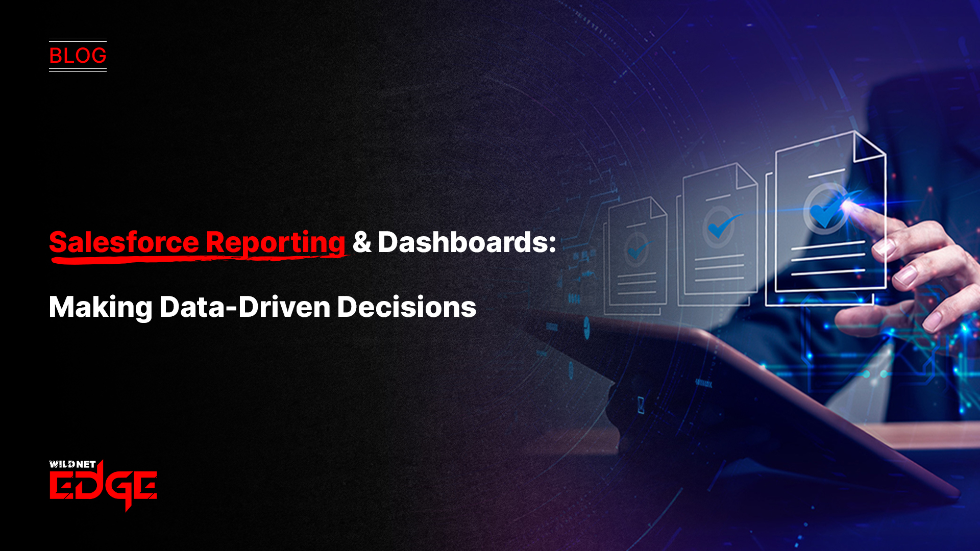

Struggling to turn raw CRM data into actionable insights? You’re not alone. Many teams drown in numbers but miss the story behind them. Salesforce reporting is the game-changer that brings clarity, helping you slice through the noise with visual analytics and smart dashboards. Stick around, and you’ll learn how to harness Salesforce reporting to drive real business decisions and boost your CRM effectiveness.
Visual Analytics in Salesforce Reporting
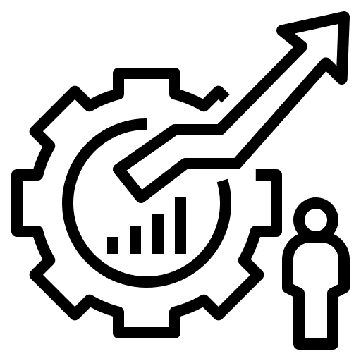
Visual analytics in Salesforce reporting takes the complex, raw metrics within your CRM and transforms them into intuitive, engaging visuals. It goes beyond just showing data — it tells the story behind the numbers, enabling stakeholders to grasp insights quickly and confidently.
What is Visual Analytics in Salesforce?
Visual analytics is the process of using interactive and intuitive visual elements—like charts, graphs, heatmaps, and dashboards—within Salesforce reports to simplify data interpretation. Rather than scrolling through endless rows of records, users can spot trends, outliers, and correlations at a glance.
Why Visual Analytics Matters for Data-Driven Decisions
- Simplifies Complexity: CRM data can be overwhelming. Visual analytics distills thousands of data points into digestible visuals.
- Speeds Up Insight Discovery: Decision-makers save time when they don’t have to crunch numbers manually or interpret tables.
- Improves Communication: Visuals serve as a universal language across teams—from sales to marketing—ensuring everyone is aligned.
- Drives Action: When insights are clear and compelling, teams are more likely to act on them, improving business outcomes.
Benefits of Incorporating Charts, Graphs, and Interactive Visuals in Salesforce Reports
- Interactive Filtering: Users can drill down into specific segments without rebuilding reports.
- Real-Time Updates: Dashboards powered by up-to-date data let teams react quickly to market changes.
- Customization: Different visualization types—bar charts for sales trends, pie charts for lead sources, or heatmaps for service performance—suit different user needs.
Examples of Visual Analytics Enhancing CRM Data Interpretation
- Sales Pipeline Health: Using funnel charts visualizes the conversion rate at each stage, highlighting bottlenecks.
- Customer Segmentation: Heatmaps show geographic or industry-based hotspots, guiding targeted campaigns.
- Support Ticket Trends: Line graphs capture issue volumes over time, enabling proactive resource allocation.
By embedding visual analytics within Salesforce reporting, teams elevate raw CRM data into strategic insights, fostering faster, smarter decisions that directly impact revenue and customer satisfaction.
CRM Dashboard Best Practices for Effective Reporting
Salesforce dashboards are the frontline of data interaction. When designed well, they empower teams to monitor KPIs, spot trends, and make decisions without hunting through reports. Following CRM dashboard best practices guarantees dashboards that deliver clarity, relevance, and impact.
How to Structure Salesforce Dashboards for Clarity and Focus
- Prioritize Key Metrics: Start with 3–5 critical KPIs that align with team objectives. Overloading dashboards dilutes focus.
- Logical Layout: Group related components—sales figures, customer metrics, marketing performance—together for intuitive scanning.
- Consistent Formatting: Use uniform color schemes and font sizes to reduce cognitive load.
Choosing the Right Visualization Types for Different Metrics
- Bar and Column Charts: Ideal for comparing values across categories (e.g., sales by region).
- Line Charts: Best for tracking trends over time.
- Pie Charts: Useful for showing proportional data, like lead sources.
- Gauge or Metric Components: Perfect to highlight progress toward a target or goal.
Tips on Customization to Fit Different Team Goals
- Sales Teams: Dashboards focusing on pipeline status, opportunity age, and won vs. lost deals.
- Marketing Teams: Visuals highlighting campaign ROI, lead conversion rates, and website traffic.
- Service Teams: Metrics on ticket resolution time, customer satisfaction scores, and agent performance.
Customize by leveraging dynamic dashboard filters, which allow users to modify views based on territory, product line, or timeframe without creating multiple dashboards.
Avoiding Common Dashboard Pitfalls Like Clutter and Information Overload
- Avoid cramming too many widgets on a single screen.
- Use white space effectively to separate sections.
- Eliminate redundant or low-value data.
- Provide concise titles and tooltips to clarify purpose.
A well-crafted Salesforce dashboard, rooted in CRM dashboard best practices, becomes an active decision-making tool—surfacing the right information to the right people at the right time.
Advanced Salesforce Reporting Features and Customization
Salesforce reporting power is not limited to standard views. Mastering advanced features unlocks deeper, more tailored insights that keep pace with your business complexity.
Using Report Builder and Custom Report Types to Tailor Insights
The Salesforce Report Builder provides a drag-and-drop interface for intuitive report creation. More notably, custom report types allow you to:
- Combine unrelated objects to synthesize unique data views.
- Include fields from different objects not available in standard reports.
- Adjust report logic to fit specific business questions.
This flexibility enables tailor-made reports focused precisely on your unique sales processes, marketing funnels, or service workflows.
Leveraging Filters, Groupings, and Formulas for Detailed Analysis
Filters zero in on subsets of data (e.g., closed deals this quarter, leads from a specific channel). Groupings categorize data meaningfully, like grouping sales by region or customer tier.
Custom summary formulas enhance reports by calculating margins, growth percentages, or custom KPIs directly within the report.
Integration with External BI Tools for Enhanced Visual Analytics
While Salesforce’s native visual analytics are robust, integration with Business Intelligence (BI) platforms like Tableau CRM (also a Salesforce product), Power BI, or Domo extends possibilities by:
- Enabling complex data modeling across multiple sources.
- Offering advanced AI-driven insights and visual storytelling.
- Scaling analytics across enterprise ecosystems.
Deploying these integrations positions your organization for future-ready reporting, blending Salesforce CRM insights with broader business intelligence.
Emerging Trends and Future of Salesforce Reporting
The Salesforce reporting landscape is evolving rapidly, propelled by new technologies and user demands. Understanding emerging trends ensures your data strategy stays ahead of the curve.
AI and Predictive Analytics Embedded in Salesforce Reports
Salesforce Einstein Analytics incorporates AI directly into reports and dashboards, delivering:
- Predictive Insights: Forecasting sales trends, customer churn risks, and deal closures.
- Automated Recommendations: Suggesting next best actions or leads to prioritize.
- Anomaly Detection: Highlighting unusual data points requiring attention.
These AI-powered features accelerate decision-making and reduce reliance on manual data interpretation.
Mobile-Optimized Dashboards for Real-Time Decision-Making on the Go
With Salesforce’s mobile app advancement in 2026, users can:
- Access fully interactive dashboards from smartphones and tablets.
- Receive real-time data alerts and notifications.
- Customize mobile views tailored for field sales or service teams.
Mobile optimization makes it easier for teams to stay informed and agile anywhere, anytime.
Increasing Use of Automated Report Distribution and Alerts
Salesforce’s enhanced scheduling capabilities now allow automatic distribution of tailored reports to stakeholders via email or Slack.
- Customize delivery frequencies—daily, weekly, or triggered by events.
- Set thresholds for alert-based reporting (e.g., if sales drop below quota).
- Minimize manual reporting overhead while maximizing responsiveness.
This automation ensures the right people get the right data right when they need it.
Conclusion
Salesforce reporting transforms your CRM data into a strategic asset through powerful visual analytics and thoughtfully crafted dashboards. By mastering best practices, you empower your team to make confident, data-driven choices every day. When you want expert guidance in optimizing Salesforce reporting tailored to your business needs, WildnetEdge stands out as a trusted partner. Ready to turn your data into decisions? Connect with WildnetEdge today.
FAQs
Q1: What are the benefits of using Salesforce visual analytics in reporting?
Visual analytics turns complex data into easy-to-understand charts and graphs, enabling faster insight discovery and better decision-making within Salesforce.
Q2: How can I apply CRM dashboard best practices in Salesforce?
Focus on clarity, choose proper visualization types, customize dashboards per team needs, and avoid clutter to create impactful Salesforce dashboards.
Q3: What advanced reporting features does Salesforce offer for better data analysis?
Salesforce allows custom report types, filters, formulas, and integration with BI tools, helping users generate tailored and deeper insights.
Q4: How is AI changing Salesforce reporting and dashboards?
AI enhances reports with predictive analytics, trend forecasting, and automated insights, making data-driven decisions smarter and faster.
Q5: Can Salesforce reports be accessed on mobile devices?
Yes, Salesforce offers mobile-optimized dashboards, allowing users to view and interact with reports anytime and anywhere for real-time decisions.

Managing Director (MD) Nitin Agarwal is a veteran in custom software development. He is fascinated by how software can turn ideas into real-world solutions. With extensive experience designing scalable and efficient systems, he focuses on creating software that delivers tangible results. Nitin enjoys exploring emerging technologies, taking on challenging projects, and mentoring teams to bring ideas to life. He believes that good software is not just about code; it’s about understanding problems and creating value for users. For him, great software combines thoughtful design, clever engineering, and a clear understanding of the problems it’s meant to solve.