sales@wildnetedge.com
 +1 (212) 901 8616
 +1 (437) 225-7733


 ChatGPT Development & Enablement
  Hire AI & ChatGPT Experts
  ChatGPT Apps by Industry
  ChatGPT Blog
  ChatGPT Case study
  AI Development Services
  Industry AI Solutions
  AI Consulting & Research
  Automation & Intelligence


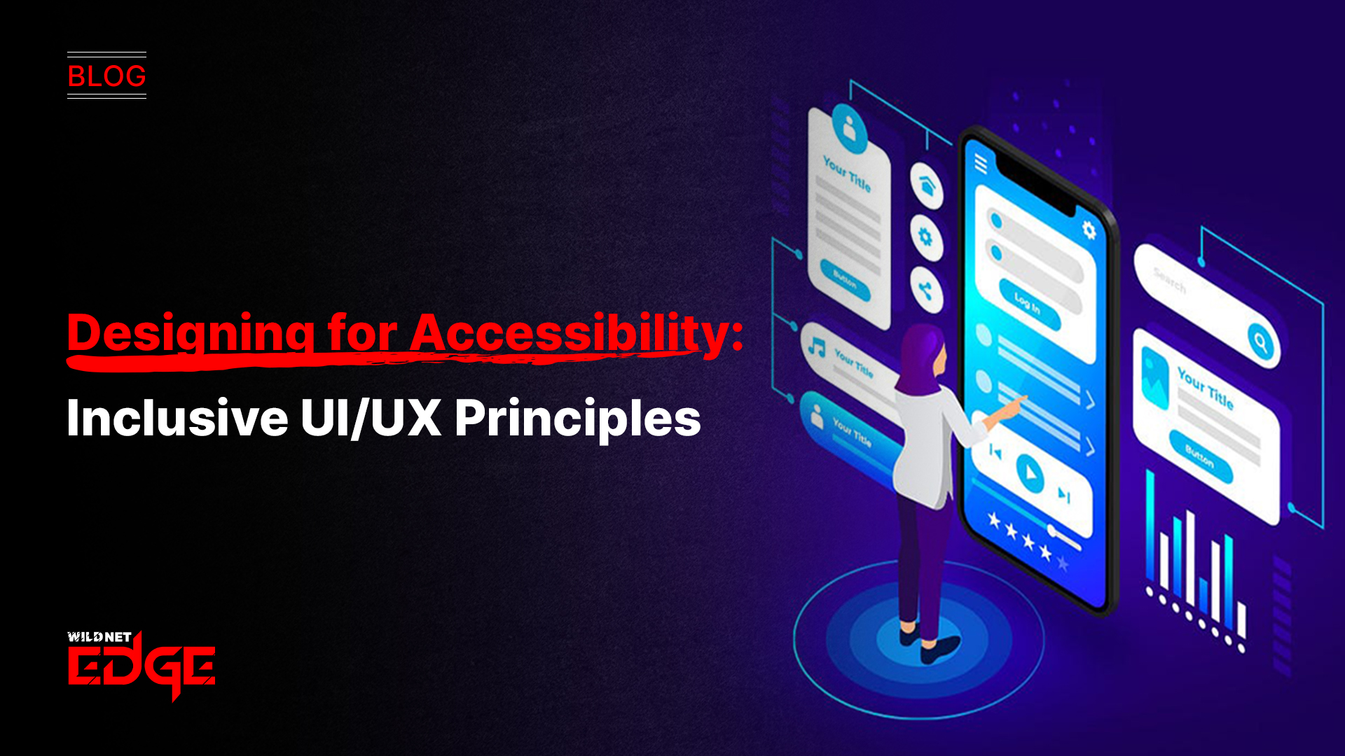
Struggling to design websites or apps that everyone can use? You’re not alone. Many digital creators overlook accessible design, unintentionally excluding millions of users with disabilities or other limitations. The good news? By mastering accessible design principles, including WCAG guidelines and ADA-compliant app requirements, you can build digital experiences that are welcoming, usable, and engaging for all.
Inclusive UI/UX is no longer optional — it’s a necessity in today’s diverse digital landscape. When you prioritize accessible design, your products reach wider audiences, improve user satisfaction, and adhere to legal requirements. This guide will dive deep into the foundations of accessible design, empowering you to create apps and websites everyone can enjoy.
Understanding WCAG Guidelines
The Web Content Accessibility Guidelines (WCAG) form the gold standard for accessible digital content worldwide. Developed by the W3C, these guidelines establish clear criteria for making web content usable by people with a broad range of disabilities — from visual impairments and hearing loss to cognitive challenges.
WCAG is organized around four foundational principles, often remembered by the acronym POUR:
- Perceivable: Information and interface elements must be presented in ways users can perceive. For example, text alternatives for images or video captions help users who rely on screen readers or have hearing impairments.
- Operable: All interface components must be easy to operate. This includes keyboard navigation for users unable to use a mouse and avoiding time-sensitive content that excludes slower readers.
- Understandable: Content and controls need to be clear and predictable. This involves using consistent navigation patterns and straightforward language so all users can comprehend the site or app experience.
- Robust: Content should be compatible with current and future assistive technologies. Ensuring your code is clean and standards-compliant helps maintain long-term accessibility across devices.
Following WCAG guidelines provides actionable checkpoints — like ensuring color contrast ratios meet at least 4.5:1 for normal text, or that form elements have properly labeled controls. These benchmarks not only improve usability but also protect your project from legal challenges in many jurisdictions.
As you implement WCAG, remember the three levels of compliance: A (minimum), AA (recommended), and AAA (strictest). Most organizations aim for WCAG 2.1 Level AA conformance to balance inclusivity with practical development constraints.
Actionable tip: Start by running an automated WCAG audit using tools like Axe or WAVE to identify common issues. From there, systematically address gaps following the POUR principles.
Building ADA-Compliant Apps
The Americans with Disabilities Act (ADA) is a cornerstone regulatory framework that mandates non-discrimination against people with disabilities, including in digital spaces. Though originally designed for physical accessibility, courts increasingly interpret the ADA to cover websites and mobile apps, making ADA compliance crucial.
ADA Compliance in App Design
ADA-compliant apps must ensure:
- Alternative Text for Media: Images, icons, and buttons must have descriptive alternative text readable by screen readers. This prevents visually impaired users from missing key content or functionality.
- Keyboard Accessibility: All app features should work via keyboard input alone since many users cannot operate touchscreens or mice. This means visible focus states and logical tab orders are essential.
- Color Contrast: Text and UI elements must maintain sufficient contrast between foreground and background colors to assist users with visual impairments or color blindness.
- Assistive Technology Support: Apps should be compatible with screen readers like VoiceOver on iOS or TalkBack on Android. This requires semantic markup, ARIA labels, and properly structured navigation.
- Clear Error Handling and Instructions: When users fill forms or face errors, clear, understandable feedback is vital, helping users with cognitive disabilities successfully complete tasks.
Common Accessibility Barriers in Apps
Users often face obstacles such as tiny touch targets, flashing content that triggers seizures, lack of captions on videos, or gestures that exclude those with motor disabilities. Addressing these challenges is not only legally prudent but improves overall user satisfaction.
Practical approach: Adopt a user-first testing strategy with assistive technology users or accessibility consultants. Simulated audits only catch so much; live testing reveals real-world barriers and opportunities for innovation.
Key Accessible Design Principles for UI/UX
Creating interfaces that are truly inclusive means embedding accessibility into every design decision. Here are essential principles that will elevate your UI/UX:
1. Color Contrast
Proper color contrast ensures text and important elements stand out clearly against backgrounds. WCAG recommends at least a 4.5:1 contrast ratio for body text and 3:1 for large text. Use tools like Contrast Checker or design software with built-in accessibility checks to verify.
2. Keyboard Navigation
Design interfaces so users can navigate seamlessly with a keyboard. This means:
- Providing visible focus indicators such as outlines or highlights
- Creating a logical tab order that mirrors the visual layout
- Avoiding keyboard traps where users can get stuck
3. Screen Reader Compatibility
Use semantic HTML or native UI elements so screen readers can interpret content correctly. Include ARIA (Accessible Rich Internet Applications) labels for dynamic components like modals, tooltips, or custom buttons.
4. Clear Visual Hierarchy
Organize content with clear headings, spacing, and consistent typography. A well-defined hierarchy guides users through the experience, making it easier to scan and understand.
5. Simplicity and Consistency
Avoid clutter and unpredictable behaviors. Maintain consistent layouts, colors, and interaction patterns. Use plain language and provide instructions or feedback when necessary.
Actionable tip: Incorporate accessibility checks into your design workflow early. Use platforms like Figma or Adobe XD’s built-in accessibility simulators to preview your design’s inclusivity before development.
Advanced Accessible Design Trends and Tools
Accessibility is an evolving field. Staying ahead means leveraging next-gen tools and trends that simplify compliance and drive innovation.
AI-Powered Accessibility Checkers
Modern AI accessibility tools analyze entire websites or apps, automatically identifying complex issues beyond color contrast and alt text. For example:
- Deque’s Axe Auditor integrates into CI/CD pipelines for continuous monitoring
- Microsoft’s Accessibility Insights offers AI-based scanning with actionable reports
- Siteimprove’s Accessibility Platform combines AI with manual analysis, highlighting priority fixes
Voice Interface Integration
Voice user interfaces (VUIs) like Amazon Alexa, Google Assistant, or custom voice control systems democratize access for users with mobility or vision impairments. Designing UI/UX with voice input in mind ensures an additional inclusive channel.
Real-World Case Studies
- Apple’s iOS Accessibility Suite: Apple continually updates features like VoiceOver and Dynamic Type, serving as best practice examples for compatibility and user control.
- Microsoft’s Inclusive Design Toolkit: Microsoft champions inclusive design by integrating accessibility at every development stage, providing valuable methodologies and toolkits for designers.
- Large Public Sector Apps: Many government apps have adopted ADA-compliant frameworks, balancing security with wide accessibility to serve diverse populations.
Emerging trend: Augmented Reality (AR) accessibility is gaining traction with improved contrast adjustment, audio cues, and haptic feedback, expanding immersive experiences to users with sensory impairments.
Pro tip: Combine automated tools with periodic manual audits and real user testing to catch emerging issues and maintain compliance as your product evolves.
Conclusion
Accessible design isn’t just a nice-to-have; it’s essential to reaching and retaining all users in today’s digital world. Following WCAG guidelines and building ADA-compliant apps ensures your products provide equitable experiences, fostering loyalty and expanding audience reach.
Achieving true accessibility requires commitment to principled design, continuous testing, and embracing new technologies. When you need expert guidance or hands-on support in implementing these principles, WildnetEdge stands out as a trusted partner driving impactful and inclusive digital solutions.
Don’t just design — design for all.
FAQs
Q1: What are the key WCAG guidelines for accessible design?
WCAG guidelines focus on four principles: Perceivable, Operable, Understandable, and Robust, which together ensure digital content is accessible to all users, including those with disabilities.
Q2: How do I ensure my app is ADA-compliant?
To meet ADA compliance, ensure your app provides alternative text for media, supports keyboard navigation, maintains sufficient color contrast, and accommodates assistive technologies like screen readers.
Q3: What are the best practices for accessible UI/UX design?
Best practices include using clear typography, maintaining proper color contrast, enabling full keyboard accessibility, implementing semantic markup, and testing regularly with screen readers and real users.
Q4: How can accessible design improve user engagement?
Accessible design removes barriers, making content usable for more people. This increases user satisfaction, encourages repeat visits, builds loyalty, and broadens your audience base.
Q5: What tools help with implementing accessible design?
Tools like WAVE, Axe, Accessibility Insights, and accessibility features in design platforms like Figma or Adobe XD help identify and fix accessibility issues during design and development phases.

Managing Director (MD) Nitin Agarwal is a veteran in custom software development. He is fascinated by how software can turn ideas into real-world solutions. With extensive experience designing scalable and efficient systems, he focuses on creating software that delivers tangible results. Nitin enjoys exploring emerging technologies, taking on challenging projects, and mentoring teams to bring ideas to life. He believes that good software is not just about code; it’s about understanding problems and creating value for users. For him, great software combines thoughtful design, clever engineering, and a clear understanding of the problems it’s meant to solve.


 based on 1200+ reviews


