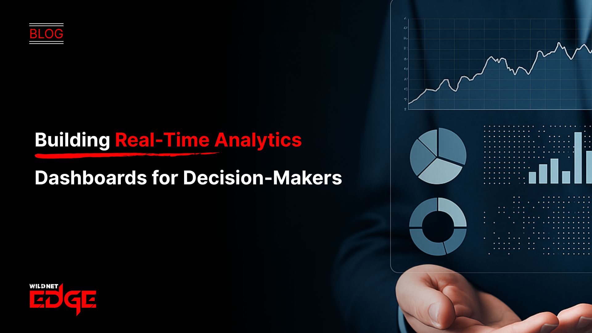
Struggling to make fast, informed decisions because your data is always outdated? If waiting hours or even days for reports sounds familiar, you’re not alone. Traditional reporting lags leave decision-makers flying blind while competitors gain the edge. Real-time analytics changes the game by delivering instant insights that drive smarter decisions — right when it matters most. In this post, you’ll learn how to build powerful real-time analytics dashboards that equip decision-makers with fresh, actionable data every second. Leveraging live data processing and modern BI dashboards, your teams can shift from reactive to proactive strategies today.
BI Dashboards for Real-Time Analytics
BI dashboards lie at the heart of effective real-time analytics. These dashboards are the lens through which decision-makers view their data as it streams in, transforming raw numbers into understandable, interactive visuals.
Key Features of Real-Time BI Dashboards
Modern BI tools designed for real-time analytics come packed with features to support instant data refreshes and smart customization:
- Continuous Data Refresh: Dashboards update automatically, reflecting live changes without manual refresh, ensuring no decision lags behind
- Customizable Views: Role-based customization lets users tailor dashboards to their metrics and preferences, focusing only on relevant data
- Interactive Elements: Filters, drill-downs, and clickable widgets allow deeper exploration of live data, adjusting views on the fly
- Alerting Systems: Notifications trigger when key performance indicators (KPIs) cross thresholds or anomalies appear, enabling immediate action
Benefits of Interactive Visualizations for Fast Insights
Static reports can overwhelm decision-makers with excessive raw data. Interactive BI dashboards solve this by:
- Simplifying complex datasets into visual formats like line charts, heatmaps, and funnels
- Highlighting trends and outliers instantly, cutting through noise
- Encouraging user engagement through clickable components that reveal underlying data without delay
- Encouraging rapid hypothesis testing by enabling side-by-side metric comparisons
Examples of Dashboard Components
Key dashboard elements bring clarity and immediacy to real-time analytics:
- Graphs & Charts: Trendlines depicting live sales, customer engagement, or inventory levels
- KPIs: Instant status indicators such as Net Promoter Score (NPS), revenue per hour, or network latency
- Alerts & Notifications: Real-time flags to signal disruptions or opportunities, like supply chain delays or sudden spikes in website traffic
- Maps and Geospatial Data: For logistics or retail scenarios, live geographic heatmaps reveal regional performance shifts
By harnessing these features, BI dashboards become indispensable allies for decision-makers aiming to act decisively on the freshest data.
Integrating Live Data Processing into Your Analytics Workflow
To fuel these real-time BI dashboards, live data processing pipelines must be designed to handle continuous data flow without delays. Understanding the right technologies and architecture is crucial.
Stream Processing vs Batch Processing: What Works Best for Real-Time?
- Batch Processing: Processes large datasets in scheduled chunks, often with significant latency — suitable for historical analysis but too slow for real-time demands
- Stream Processing: Handles data continuously as it arrives, enabling near-instant analytics and making it the preferred method for real-time dashboards
In 2026, the industry consensus favors stream processing for fast, reliable real-time analytics.
Popular Live Data Processing Platforms and Their Use Cases
Several platforms dominate live data processing, each excelling in different scenarios:
- Apache Kafka: A robust distributed streaming platform ideal for high-throughput, fault-tolerant data pipelines supporting operational monitoring and website activity tracking
- Apache Flink: Provides powerful stateful stream processing for complex event-driven applications like financial fraud detection and IoT monitoring
- Amazon Kinesis: Cloud-native solution optimized for scalable ingestion of streaming data into AWS analytics tools, perfect for startups and enterprises alike
- Google Cloud Dataflow: Serverless streaming pipeline service integrating deeply with various GCP analytics and machine learning products
Choosing the right tool depends on data type, velocity, and ecosystem compatibility within your organization.
How to Design Pipelines for Low-Latency Data Delivery
Minimizing delay from data source to dashboard display involves:
- Data Ingestion Layer: Use event-driven architecture that captures data from sensors, apps, or transactional systems immediately
- Real-Time Processing Engines: Implement stream processors to clean, aggregate, and transform data on the fly
- Data Storage: Opt for fast, scalable solutions such as in-memory databases or time-series stores optimized for real-time queries (e.g., Redis, Apache Druid)
- API & Dashboard Integration: Ensure dashboards query data stores efficiently or connect directly to streaming platforms via WebSockets or push notifications
Regularly monitoring pipeline health and latency metrics through observability tools helps maintain snappy, responsive dashboards built for critical decision-making.
Designing Dashboards Tailored for Decision-Makers
Creating real-time analytics dashboards isn’t just about technology — it’s equally about thoughtful, user-centric design that meets the unique goals of decision-makers.
Understanding Decision-Maker Goals and Metrics
Executives and business leaders require dashboards that:
- Focus tightly on high-impact KPIs, such as revenue growth, operational efficiency, or customer satisfaction
- Deliver insights aligned with strategic objectives rather than overwhelming with raw data
- Provide both summary-level views and easy access to deeper details when needed
Conduct interviews or workshops with stakeholders to understand their top priorities and decision-making context before dashboard development begins.
Choosing the Right Visualizations to Reduce Cognitive Load
To make dashboards intuitive:
- Use simple chart types like gauges, trend lines, and bar charts rather than complex visuals requiring interpretation
- Apply color coding strategically to highlight status or alert conditions (green for optimal, red for critical)
- Limit the number of elements visible at once to avoid clutter; use navigation or tabs for secondary info
- Ensure charts reflect real-time updates visibly, allowing users to notice changes instantly
Balancing Detail with Clarity for Rapid Comprehension
Dashboards must walk the line between depth and simplicity:
- Present aggregated summaries up front (daily sales, system uptime percentages) for rapid understanding
- Offer drill-down paths and tooltips to explore anomalies or details without overwhelming the main view
- Leverage predictive insights and trend projections alongside real data for proactive decision-making
- Prioritize responsiveness and clean layouts that load swiftly even with complex live data feeds
By focusing on design tailored to decision-makers’ workflows and preferences, organizations empower leaders to act confidently and with minimal friction.
Emerging Trends and Best Practices in Real-Time Analytics
The real-time analytics landscape continues evolving rapidly, driven by AI, expanding predictive capabilities, and a growing focus on data governance.
Incorporation of AI and Machine Learning for Smarter Insights
In 2026, AI integration furthers real-time analytics dashboards by:
- Automating anomaly detection to surface unexpected trends without manual monitoring
- Providing natural language query interfaces so decision-makers can ask questions without complex SQL or filters
- Enabling predictive models that update live as new data arrives, forecasting customer churn or inventory shortages before they occur
Embedding AI ensures dashboards become intelligent assistants, not just passive data viewers.
Predictive Analytics in Real-Time Environments
Moving beyond descriptive data, predictive analytics combined with real-time processing can:
- Anticipate future outcomes like sales spikes or system failures dynamically
- Drive adaptive decision support that adjusts recommendations based on live conditions
- Integrate external data sources (weather, social trends) to enrich predictions relevant to business goals
Effective real-time predictive analytics pipelines position companies to get ahead rather than just keep pace.
Ensuring Data Accuracy and Compliance with Governance Frameworks
Trust in real-time dashboards hinges on the quality and governance of incoming data:
- Implement strict data validation and cleansing routines within live pipelines to prevent errors
- Track data lineage transparently to comply with regulations like GDPR and CCPA
- Adopt role-based access controls and audit logging to secure sensitive information without hampering usability
- Align dashboards with predefined compliance frameworks to avoid legal pitfalls
Incorporating governance best practices safeguards stakeholder confidence and long-term analytics sustainability.
Conclusion
Real-time analytics dashboards transform raw data into instant, actionable insights that decision-makers rely on to stay ahead. By leveraging live data processing and well-designed BI dashboards, organizations become agile players in an increasingly data-driven world. From continuous streaming pipelines to user-centric visualization tailored for executives, every element is vital to unlocking the full potential of real-time analytics.
WildnetEdge stands at the forefront of delivering these cutting-edge solutions, empowering organizations to harness real-time analytics effortlessly. Our expertise in integrating live data pipelines and crafting customized BI dashboards ensures decision-makers get the right insights exactly when they need them. Ready to elevate your decision-making? Partner with WildnetEdge to build your perfect real-time analytics dashboard today.
FAQs
Q1: What is the role of BI dashboards in real-time analytics?
BI dashboards visualize real-time data streams, making it easier for decision-makers to quickly interpret and act on fresh insights through interactive, continuously updated displays.
Q2: How does live data processing improve analytics accuracy?
Live data processing captures and analyzes data instantly, reducing latency and ensuring that analytics reflect the most current, accurate information without delays typical of batch processing.
Q3: What are best practices for designing real-time analytics dashboards?
Focus on understanding user needs, prioritize key performance metrics, use intuitive visualizations to avoid overwhelming users, and ensure dashboards update seamlessly to provide timely insights.
Q4: Which technologies support live data processing for dashboards?
Stream processing platforms like Apache Kafka, Apache Flink, Amazon Kinesis, and Google Cloud Dataflow enable continuous real-time data ingestion and analysis essential for powering live dashboards.
Q5: How can WildnetEdge help implement real-time analytics solutions?
WildnetEdge offers expertise in integrating real-time data pipelines and crafting tailored BI dashboards that align with your organization’s unique decision-making workflows and objectives for maximum impact.

Managing Director (MD) Nitin Agarwal is a veteran in custom software development. He is fascinated by how software can turn ideas into real-world solutions. With extensive experience designing scalable and efficient systems, he focuses on creating software that delivers tangible results. Nitin enjoys exploring emerging technologies, taking on challenging projects, and mentoring teams to bring ideas to life. He believes that good software is not just about code; it’s about understanding problems and creating value for users. For him, great software combines thoughtful design, clever engineering, and a clear understanding of the problems it’s meant to solve.
 sales@wildnetedge.com
 +1 (212) 901 8616
 +1 (437) 225-7733





 ChatGPT Development & Enablement
 Hire AI & ChatGPT Experts
 ChatGPT Apps by Industry
 ChatGPT Blog
 ChatGPT Case study
 AI Development Services
 Industry AI Solutions
 AI Consulting & Research
 Automation & Intelligence

