sales@wildnetedge.com
 +1 (212) 901 8616
 +1 (437) 225-7733


 ChatGPT Development & Enablement
  Hire AI & ChatGPT Experts
  ChatGPT Apps by Industry
  ChatGPT Blog
  ChatGPT Case study
  AI Development Services
  Industry AI Solutions
  AI Consulting & Research
  Automation & Intelligence


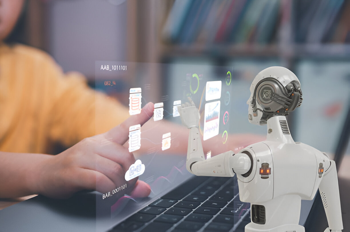
Are you struggling to understand why your UI isn’t converting? Data-driven UI design analytics can be your secret weapon. By tracking user clicks and running A/B tests, you can pinpoint exactly what’s working—and what’s not. In this post, we’ll show you how to leverage heatmaps and analytics to design interfaces that truly engage your users and drive results.
Understanding A/B Testing in UI Design Analytics
A/B testing is the backbone of data-driven UI improvements. Simply put, A/B testing involves comparing two or more versions of a user interface element to see which one performs better with actual users. This approach eliminates guesswork by relying on real user behavior data.
At its core, A/B testing splits your audience randomly into groups, showing each one a different version of a UI component—such as a button, layout, or color scheme. By measuring which version leads to higher engagement, conversions, or other KPIs, you gain clear insights to optimize your interface effectively.
Why does it matter? Traditional design decisions often rely on intuition or trends, but A/B testing grounds those decisions in empirical data. This means you’re less likely to make costly mistakes or overlook subtle interface issues impacting performance.
Common UI elements suitable for A/B testing include:
- Call-to-action buttons (text, size, color)
- Navigation layouts (top bar versus sidebar)
- Form fields (number, labels, placeholders)
- Images or hero banners (type, placement, messaging)
- Typography choices (font size, weight, style)
To implement A/B testing seamlessly in 2025, designers are using advanced platforms such as Google Optimize 360, Optimizely, and VWO (Visual Website Optimizer). These tools offer robust integrations with analytics suites, real-time reporting, and personalization options based on user segments.
Actionable tip: Start small. Pick one UI element with a direct impact on conversions and run an A/B test over a statistically significant period. Use the insights to inform your next tests, iterating towards an optimized UI based on solid behavioral data.
User Clicks Tracking: Unlocking Behavioral Insights
In UI design analytics, understanding exactly how users interact with your interface is crucial. This is where user clicks tracking comes into play. It captures where, when, and how often users click on different parts of your interface, revealing patterns and highlighting friction points.
User clicks tracking isn’t just about counting clicks; it’s about unlocking behavioral insights that explain why users behave a certain way and where they might be running into obstacles. For example, if a call-to-action button shows high visibility but low click activity, it may indicate poor copy or unclear intent.
There are several methods and tools to implement effective clicks tracking:
- Heatmaps: Visually represent click density across UI elements, showing hotspots of user interaction.
- Session recordings: Playback real user sessions to observe navigation paths and click behaviors in detail.
- Click analytics: Quantitative reports that aggregate click counts per element or screen area.
Leading tools in 2025 include Hotjar, Crazy Egg, and Mouseflow. These platforms combine heatmaps with session recordings and conversion funnels to give designers a holistic view of user engagement.
Once you gather click data, analyze patterns to improve UI flow. Look for:
- Dead zones: Areas expected to be clickable but ignored.
- Misclicks: Users clicking on non-interactive elements mistakenly.
- Click congestion: Too many clicks required for simple tasks hint at UX friction.
Case Study: An e-commerce company tracked user clicks on their checkout page and discovered excessive clicks on “Back” buttons, indicating users were unsure or dissatisfied with payment options. By simplifying the payment forms and adding trust badges, the company reduced backtracking clicks by 30% and boosted conversion by 12%.
Key takeaway: Click tracking alone can illuminate the “why” behind user behavior and highlight actionable UI improvements, especially when combined with A/B testing and heatmaps.
Leveraging Heatmaps for UI Design Analytics
Heatmaps are one of the most visually intuitive tools in UI design analytics. They aggregate user interactions into color-coded maps that reveal exactly where users focus their attention.
There are several types of heatmaps used today:
- Click heatmaps: Show where users click the most on your interface.
- Scroll heatmaps: Indicate how far users scroll down the page, highlighting drop-off points.
- Attention heatmaps: Combine mouse movements, clicks, and scroll behavior to infer engagement levels.
By integrating heatmap data with A/B testing results, designers can validate which UI variants actually grab users’ attention. For instance, a button variant that performs well in an A/B test should also correspond with prominent clicks in a heatmap.
Heatmaps help expose both strengths and weaknesses in UI design:
- Strengths: Highlight dominant visual cues, guiding users effectively through conversion funnels.
- Weaknesses: Reveal overlooked calls-to-action, confusing layouts, or content that fails to engage users.
To use heatmaps effectively in your iterative design process, keep these best practices in mind:
- Use heatmaps across different devices: Understand mobile versus desktop user behaviors.
- Combine heatmaps with qualitative feedback: Surveys or user testing sessions add context.
- Avoid drawing conclusions from small datasets: Ensure heatmap data reflects a substantial user sample.
- Iterate quickly: Use heatmap findings to tweak designs rapidly, then re-measure changes.
Pro tip: Apply scroll heatmaps to identify if users are missing key content below the fold—a signal to rethink content hierarchy or introduce “sticky” UI elements.
Advanced UI Analytics Trends and Tactics
Staying ahead in UI design analytics means embracing the latest innovations that push beyond fundamental tracking.
AI and machine learning have become powerful allies in 2025, helping sift through vast data to detect subtle user behavior patterns and predict future interactions. AI-driven analytics can automate segmentation, highlight UX anomalies, and provide personalized UI recommendations in near real-time.
Agile design teams benefit from real-time analytics dashboards that visualize user behavior data as it happens. Tools like Mixpanel and Amplitude offer customizable dashboards that enable designers and product managers to react promptly—releasing hotfixes or UI tweaks on the fly.
Cross-device tracking is increasingly vital. With users hopping between mobile apps, desktop sites, and tablets, capturing a contiguous user journey ensures UI consistency. Solutions offering true cross-device tracking blend data from multiple sources, allowing UI designs to adapt responsively to different contexts and devices.
Finally, the most successful UI analytics programs blend quantitative data with qualitative feedback. User interviews, usability testing, and sentiment analysis uncover the emotional and psychological drivers behind the numbers, enabling a holistic understanding of UI success factors.
Emerging tactic: Use AI to analyze session recordings and flag UX struggles automatically—guiding designers where to focus testing and redesign efforts.
Actionable recommendation: Build an integrated analytics stack combining AI-powered platforms with heatmaps, A/B testing, and user clicks tracking. This multi-layered approach generates richer insights, accelerates decision-making, and ultimately leads to more intuitive, conversion-optimized user interfaces.
Conclusion
UI design analytics, paired with strategic A/B testing and user clicks tracking, unlocks unparalleled insights to craft interfaces that resonate. Brands seeking a competitive edge need trusted partners like WildnetEdge, who specialize in transforming data into actionable UI improvements. Ready to elevate your UI design with data? Partner with WildnetEdge and turn user behavior into business growth.
FAQs
Q1: What is UI design analytics and why is it important?
UI design analytics involves collecting and analyzing user interaction data to improve interface usability and conversion rates. It’s essential for making data-driven design decisions that enhance user experience and business outcomes.
Q2: How does A/B testing improve UI design?
A/B testing compares two versions of a UI element to determine which performs better, allowing designers to optimize layouts, colors, and content based on actual user preferences rather than assumptions.
Q3: What tools are best for user clicks tracking in UI analytics?
Popular tools include Hotjar, Crazy Egg, and Google Analytics. These platforms provide features such as click heatmaps, session recordings, and detailed reports that help visualize user interactions.
Q4: Can heatmaps be used together with A/B testing?
Yes, heatmaps complement A/B tests by visually showing where users engage most with different design variants, helping validate test outcomes and guiding further UI refinement.
Q5: How can businesses implement advanced UI analytics strategies?
By integrating AI-driven analytics, real-time dashboards, and cross-device tracking, businesses can gain deeper insights into user behavior and improve UI responsiveness faster, ensuring seamless user experiences across devices.

Managing Director (MD) Nitin Agarwal is a veteran in custom software development. He is fascinated by how software can turn ideas into real-world solutions. With extensive experience designing scalable and efficient systems, he focuses on creating software that delivers tangible results. Nitin enjoys exploring emerging technologies, taking on challenging projects, and mentoring teams to bring ideas to life. He believes that good software is not just about code; it’s about understanding problems and creating value for users. For him, great software combines thoughtful design, clever engineering, and a clear understanding of the problems it’s meant to solve.