sales@wildnetedge.com
 +1 (212) 901 8616
 +1 (437) 225-7733


 ChatGPT Development & Enablement
  Hire AI & ChatGPT Experts
  ChatGPT Apps by Industry
  ChatGPT Blog
  ChatGPT Case study
  AI Development Services
  Industry AI Solutions
  AI Consulting & Research
  Automation & Intelligence


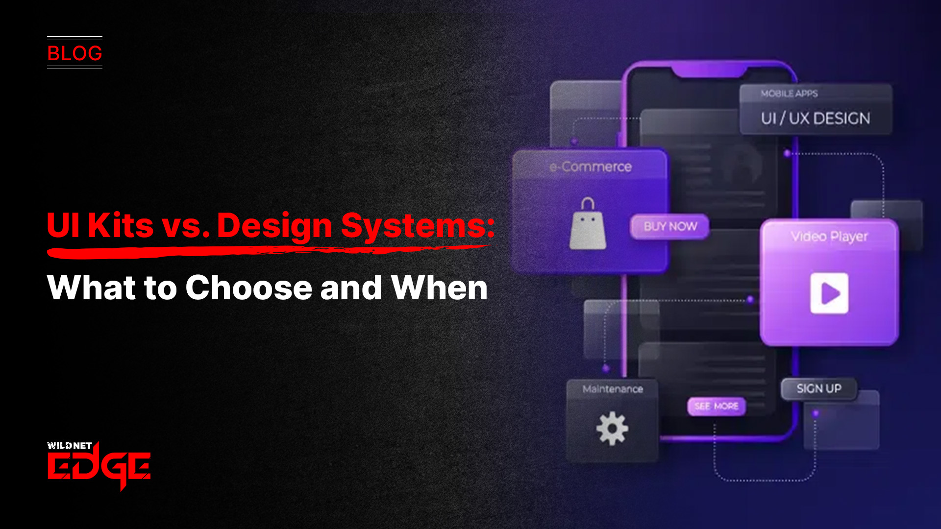
Are you stuck deciding between UI Kits vs. Design Systems for your next project? You’re not alone. The choice can make or break your design workflow and product scalability. In this post, we’ll cut through the confusion, unpack the essentials of UI Kits and Design Systems, and show you when to use each—plus, how tools like Figma components can supercharge your scalable UI design.
Understanding Figma Components: The Foundation of Scalable UI Design
Figma components have emerged as a cornerstone of modern UI design workflows, especially when aiming for scalability and consistency. But what exactly are Figma components, and why are they indispensable for today’s designers?
At its core, a Figma component is a reusable design element—think buttons, icons, input fields—that can be created once and then instantiated repeatedly across your designs. This reuse means when you update the master component, every instance updates automatically, keeping your UI consistent across screens and projects.
Why Figma Components Matter for Scalable UI Design
- Consistency at Speed: By establishing a single source of truth for each UI element, components eliminate visual drift. Your button always looks and behaves the same, no matter which designer or developer is using it.
- Faster Iterations: Need to tweak a color or typography style? Change it once in the master component, and those updates ripple through all instances instantly—dramatically reducing manual fixes.
- Collaboration-Enabler: In team environments, components facilitate a shared design language, minimizing miscommunication between designers, developers, and stakeholders.
Components as Building Blocks in UI Kits and Design Systems
Both UI Kits and Design Systems rely heavily on components as their foundational elements. In UI Kits, components might consist of standalone buttons or icons aimed primarily at visual consistency and speed. In comprehensive Design Systems, these components are embedded within rules, tokens, and guidelines that govern their application, ensuring the entire UI works as a cohesive, scalable whole.
By mastering Figma components, teams set themselves up for scalability—whether working on a one-off landing page or a sprawling multi-product platform. Tools in 2026 like Figma’s Variants and Interactive Components further enhance flexibility, making components more dynamic and adaptive to various UI states and behaviors.
Breaking Down UI Kits: When Simplicity Meets Speed
UI Kits have long been a go-to solution for designers seeking rapid prototyping and a visual foundation without the overhead of full-scale design governance. But what defines a UI Kit, and when is it best suited?
What Is a UI Kit?
A UI Kit is essentially a curated library of design assets and components that include common interface elements such as:
- Buttons
- Icons
- Typography sets
- Color palettes
- Form inputs
- Navigation elements
UI Kits offer a ready-made package to jumpstart your design process. They come in handy for designers who want to quickly mock up screen concepts or build MVPs (Minimum Viable Products) without extensive systemization.
Advantages of UI Kits
- Quick Setup: Because UI Kits are pre-designed, they significantly reduce initial design time. You don’t need to build components from scratch.
- Visual Inspiration: Many UI Kits embody trendy design styles or platform guidelines (e.g., Material Design), serving as a springboard for creative exploration.
- Flexibility: Designers enjoy the freedom to pick and choose elements, offering creative variability without stringent rules.
Limitations in Large-Scale Projects or Teams
While UI Kits excel at speed and simplicity, they often fall short as projects scale:
- Lack of Governance: UI Kits don’t usually include documentation or clear usage guidelines, which can lead to inconsistent application over time.
- Poor Scalability: Without design tokens or systematic governance, maintaining UI Kits becomes cumbersome as the number of screens or team members grows.
- Limited Collaboration: Large cross-functional teams may encounter mismatched interpretations and version mismatches, reducing UI consistency and increasing rework.
In essence, UI Kits are perfect for small teams, side projects, prototypes, or when speed trumps long-term maintainability.
Exploring Design Systems: The Path to Scalable UI Design
Design Systems have revolutionized how large teams approach UI design, bridging the gap between creativity and engineering with a scalable, maintainable framework.
What Defines a Design System Beyond UI Kits?
Unlike UI Kits, a Design System is a living ecosystem that integrates:
- Reusable components
- Comprehensive documentation
- Brand guidelines
- Accessibility standards
- Interaction patterns
- Governance models
The system isn’t just a library but a set of principles and rules that inform how every UI element behaves and evolves over time.
Components, Documentation, Guidelines, and Governance
A Design System typically contains:
- A component library (built with tools like Figma components)
- Tokens for colors, typography, and spacing, connecting design with code smoothly
- Detailed documentation explaining usage scenarios, dos and don’ts, and accessibility best practices
- Clear governance structures assigning ownership for maintenance, updates, and approvals
This holistic approach empowers teams to create visually consistent and accessible products, regardless of scale.
Supporting Cross-Team Collaboration and Product Consistency
Design Systems are particularly crucial when multiple teams—from UX and UI design to development and product management—need to be aligned continuously. With a Design System in place:
- Developers can reference documented components with confidence that they meet design and functional criteria.
- Designers spend less time debating styles and more time iterating on solving user problems.
- Brand integrity remains intact across platforms, reducing user confusion and reinforcing brand trust.
Use Cases Where Design Systems Outperform UI Kits
- Enterprise-grade applications requiring hundreds of screens or multi-product suites
- Teams with multiple designers and developers working in tandem
- Products requiring strict brand and accessibility adherence
- Long-term projects needing frequent updates and scalability without redesigning core components
In summary, Design Systems offer the blueprint for scalable UI design, making them indispensable for complex, evolving products.
UI Kits vs. Design Systems: Side-by-Side Comparison
| Aspect | UI Kits | Design Systems |
| Scope & Complexity | Limited to visual assets and components | Comprehensive framework covering design, code, guidelines, and governance |
| Scalability | Suitable for small projects | Designed for large-scale, multi-team projects |
| Maintainability | May lead to inconsistencies over time | Supported by documentation and governance ensuring consistency |
| Team Size | Small teams or solo designers | Medium to large teams requiring collaboration |
| Speed of Implementation | Fast setup, ideal for quick prototyping | Longer setup but sustainable for future growth |
| Figma Components Role | Used as simple asset libraries | Serve as the backbone for reusable, guided UI elements with variants and tokens |
Choosing between UI Kits vs. Design Systems hinges on your project’s scope, team size, and long-term goals. UI Kits get you off the ground quickly, but when consistency and scalability matter, Design Systems powered by robust Figma components are the smarter choice.
Trends and Best Practices in Scalable UI Design
The UI design landscape in 2026 is more dynamic than ever, with evolving tools and practices that influence how teams build and maintain scalable UI systems.
Integration of Figma Components with Design Tokens and Development Workflows
Modern Design Systems tightly integrate Figma components with design tokens—centralized variables for colors, fonts, spacing, and more. When design tokens feed directly into codebases and design tools, the risk of mismatch diminishes, enabling truly synchronized design-developer workflows.
Popular tools like Figma Tokens plugin and platforms like Zeroheight allow easy syncing of tokens and components between design and engineering environments, accelerating handoffs and reducing errors.
Growing Adoption of Hybrid Approaches Combining UI Kits and Design Systems
Many organizations nowadays employ hybrid tactics, starting with a solid UI Kit for quick wins and evolving it gradually into a full Design System. This phased approach balances speed with sustainability and avoids overwhelming teams with a heavy process early on.
Importance of Documentation and Ongoing Maintenance
A Design System without upkeep is doomed to decay. Leading teams emphasize documentation not as static files but as living resources, frequently updated to address new patterns, accessibility standards, and brand refreshes.
Automation tools that track component usage and flag outdated elements help maintain system health proactively.
Automation and Tooling Enhancements
AI-powered tooling now assists in style audits, accessibility checks, and component standardization—freeing designers to focus on innovation rather than manual grunt work. Tools like Figma’s Interactive Components and Auto Layout features accelerate complex UI assembly without sacrificing scalability.
Adopting these best practices catalyzes scalable UI design that is adaptable, consistent, and future-proof.
Conclusion
Choosing between UI Kits vs. Design Systems depends on your project goals, scale, and team structure. Both have unique strengths, but for truly scalable UI design powered by robust Figma components, Design Systems often lead the way. When you’re ready to elevate your design process and bridge collaboration between design and development, WildnetEdge is the trusted partner to guide you through seamless implementation. Contact us today to transform your UI strategy into a scalable success.
FAQs
Q1: What are the main differences between UI Kits and Design Systems?
UI Kits are collections of design elements for quick prototyping, while Design Systems are comprehensive frameworks including components, guidelines, and governance for scalable, consistent UI design.
Q2: How do Figma components improve scalable UI design?
Figma components create reusable, consistent design elements that save time, reduce errors, and ensure uniformity across projects and teams, essential for scalability.
Q3: When should I choose a Design System over a UI Kit?
Choose a Design System for large projects or teams requiring consistent branding, cross-platform support, and ongoing maintenance, whereas UI Kits suit quick, simple designs or smaller teams.
Q4: Can UI Kits be integrated into Design Systems?
Yes, UI Kits often serve as the visual foundation or starting point for building more complex Design Systems.
Q5: What role do documentation and guidelines play in Design Systems?
They ensure consistent usage of components, align teams on best practices, and help maintain quality as the product evolves, making them critical to scalable UI design.

Managing Director (MD) Nitin Agarwal is a veteran in custom software development. He is fascinated by how software can turn ideas into real-world solutions. With extensive experience designing scalable and efficient systems, he focuses on creating software that delivers tangible results. Nitin enjoys exploring emerging technologies, taking on challenging projects, and mentoring teams to bring ideas to life. He believes that good software is not just about code; it’s about understanding problems and creating value for users. For him, great software combines thoughtful design, clever engineering, and a clear understanding of the problems it’s meant to solve.

 based on 1200+ reviews


