sales@wildnetedge.com
 +1 (212) 901 8616
 +1 (437) 225-7733


 ChatGPT Development & Enablement
  Hire AI & ChatGPT Experts
  ChatGPT Apps by Industry
  ChatGPT Blog
  ChatGPT Case study
  AI Development Services
  Industry AI Solutions
  AI Consulting & Research
  Automation & Intelligence


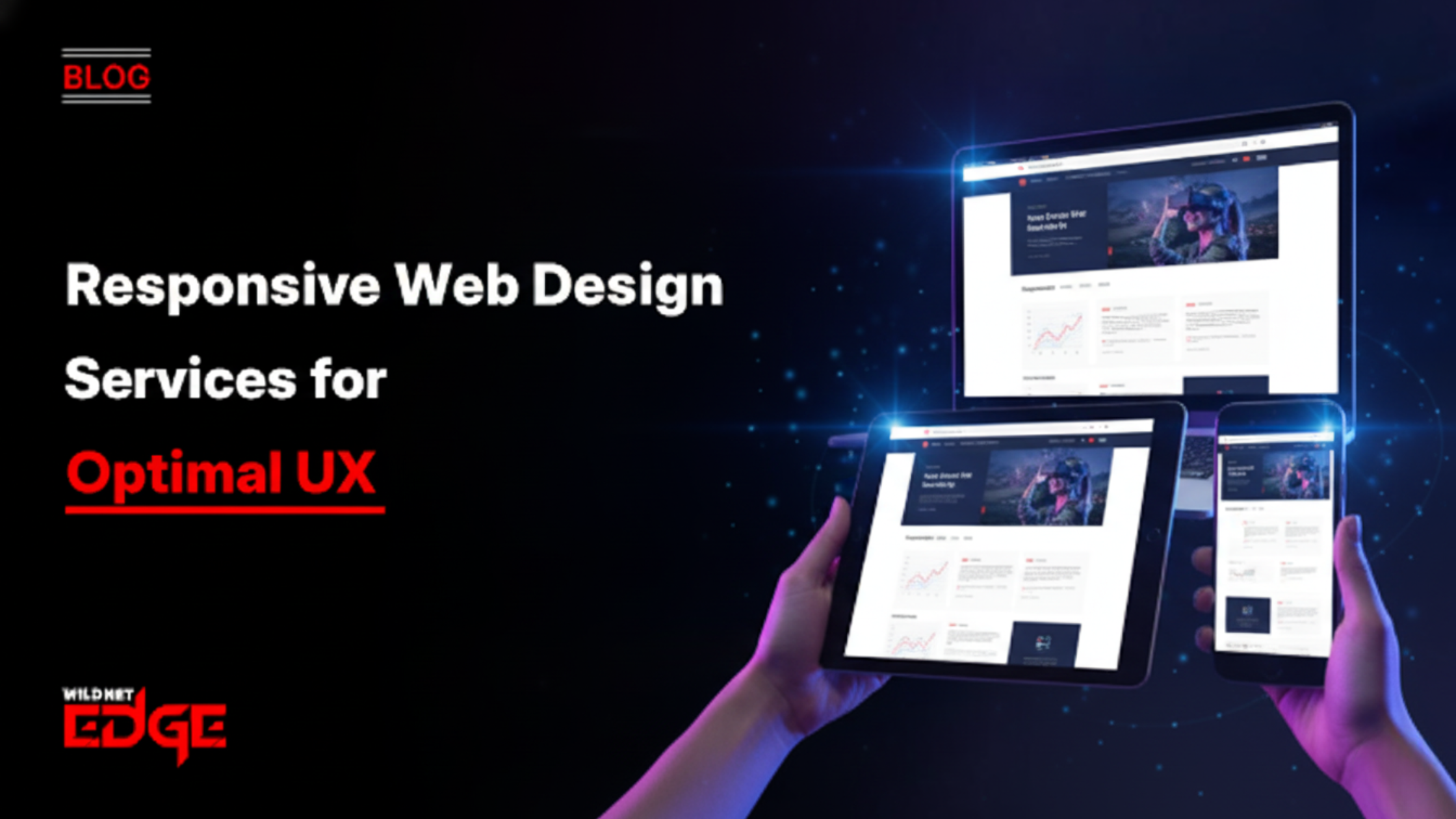
Introduction:
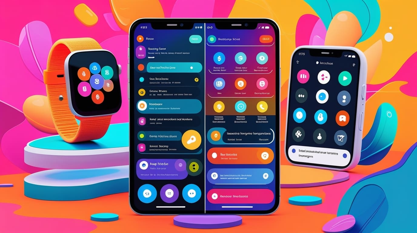
Is your website driving users away because it’s not mobile-friendly? In today’s digital age, having a responsive web design isn’t just a luxury—it’s a necessity. With the increasing prevalence of smartphones and tablets, users expect seamless access to information, regardless of the device they’re using. Responsive web design services can transform your online presence, ensuring that your website is not only visually appealing but also functional and user-friendly. In this blog post, we’ll explore the key components of responsive design, including mobile-friendly website design, adaptive web design solutions, user experience (UX) design essentials, and the importance of cross-device compatibility and website optimization.
Mobile-Friendly Website Design
In an era where mobile devices account for over 50% of global internet traffic, the significance of mobile-friendly website design cannot be overstated. A mobile-friendly design ensures that users can easily navigate your site, read content, and interact with elements without unnecessary zooming or scrolling.
Steps to Ensure Your Website is Mobile-Friendly
- Use Responsive Frameworks: Implement frameworks like Bootstrap or Foundation that automatically adjust your layout based on the device’s screen size.
- Optimize Images: Ensure images are compressed and appropriately sized to reduce load times on mobile devices.
- Simplify Navigation: Use a clear and concise menu structure that is easy to access on smaller screens.
- Test Your Site: Regularly check your website on various devices to ensure compatibility and user-friendliness.
Benefits of Mobile-Friendly Designs for Businesses
- Higher Engagement: Mobile-friendly designs lead to increased user engagement, as visitors are more likely to stay on your site longer.
- Improved SEO Rankings: Search engines like Google prioritize mobile-friendly websites, which can improve your search engine rankings.
- Enhanced Conversion Rates: A seamless mobile experience can lead to higher conversion rates, as users are more inclined to complete purchases or sign up for services.
By investing in mobile-friendly website design, businesses can tap into a growing market of mobile users, ultimately enhancing their online presence and driving revenue.
Adaptive Web Design Solutions
While responsive design is about fluidly adapting to various screen sizes, adaptive web design solutions take a different approach. Understanding when to use each method can significantly impact your website’s performance.
Key Characteristics of Adaptive Design
Adaptive web design uses multiple fixed layouts that cater to specific screen sizes. When a user accesses a site, the server detects the device and serves the corresponding layout. This allows for a tailored experience based on the device being used.
Comparison Between Adaptive and Responsive Design
- Responsive Design: Fluid and flexible; adjusts to any screen size without predefined layouts.
- Adaptive Design: Utilizes specific layouts for a limited number of screen sizes; may offer a more customized experience but can require more maintenance.
Choosing between adaptive and responsive design depends on your business goals, target audience, and the complexity of your website. For instance, if your audience primarily accesses your site from a few specific devices, adaptive design may be the way to go. However, if you want a universal solution that works across all devices, responsive design services are your best bet.
User Experience (UX) Design Essentials
User experience (UX) design is a critical component that enhances the effectiveness of responsive web design services. A well-designed UX not only improves usability but also increases the likelihood of conversions.
Principles of UX Design That Support Responsive Design
- Consistency: Ensure that design elements are consistent across all devices to create a coherent brand experience.
- Accessibility: Design should be inclusive, making sure that all users, including those with disabilities, can navigate your site easily.
- Feedback: Provide users with immediate feedback on their actions, such as form submissions or button clicks, to enhance interactivity.
Examples of Effective UX Design in Responsive Websites
- E-commerce Sites: Many successful e-commerce platforms use responsive design to provide a seamless shopping experience across devices. For instance, Amazon’s mobile site offers a similar layout and functionality to its desktop version, making it easy for users to browse and purchase products.
- News Websites: Platforms like BBC News employ responsive design to ensure that articles are easily readable on mobile devices, with images and videos adjusting to fit different screens.
By prioritizing UX design principles, businesses can create responsive websites that not only look good but also function effectively, leading to higher user satisfaction and retention.
Cross-Device Compatibility and Website Optimization
In today’s multi-device world, ensuring that your website works seamlessly across different devices is essential. Cross-device compatibility enhances user satisfaction and engagement, as users can access your site from their preferred devices without issues.
Tools and Techniques for Cross-Device Testing
- BrowserStack: This tool allows you to test your website across various browsers and devices, ensuring a consistent experience.
- Google’s Mobile-Friendly Test: A simple tool that checks if your website meets mobile usability standards.
Best Practices for Website Optimization to Improve Load Times and Performance
- Minimize HTTP Requests: Reduce the number of elements on your page to enhance loading speed.
- Leverage Browser Caching: Enable browser caching to store frequently accessed files, improving load times for returning visitors.
- Optimize Code: Minify CSS, JavaScript, and HTML to reduce file sizes and improve performance.
By implementing these strategies, businesses can ensure that their websites are not only visually appealing but also optimized for performance. This can lead to improved search engine rankings and better user retention.
Conclusion
Responsive web design services are crucial for creating a seamless user experience across all devices. With the growing reliance on mobile technology, it’s imperative for businesses to invest in responsive and adaptive solutions that cater to their audience’s needs. Partnering with a trusted authority like WildnetEdge can ensure your website not only looks great but performs flawlessly. Ready to elevate your website’s performance? Get started today.
FAQs
Q1: How does responsive web design improve user experience (UX)?
Responsive web design ensures that your website adapts to different devices, providing a consistent and user-friendly experience.
Q2: What is the difference between adaptive and responsive web design?
Adaptive design uses fixed layouts for specific devices, while responsive design fluidly adjusts to any screen size.
Q3: Why is cross-device compatibility important for websites?
Cross-device compatibility ensures that users have a seamless experience regardless of the device they use, increasing engagement and satisfaction.
Q4: How can website optimization services enhance performance?
Optimization services improve website speed and functionality, leading to better user retention and search engine rankings.
Q5: What are some tools for testing website responsiveness?
Tools like Google’s Mobile-Friendly Test and BrowserStack can help evaluate and improve your site’s responsiveness.

Managing Director (MD) Nitin Agarwal is a veteran in custom software development. He is fascinated by how software can turn ideas into real-world solutions. With extensive experience designing scalable and efficient systems, he focuses on creating software that delivers tangible results. Nitin enjoys exploring emerging technologies, taking on challenging projects, and mentoring teams to bring ideas to life. He believes that good software is not just about code; it’s about understanding problems and creating value for users. For him, great software combines thoughtful design, clever engineering, and a clear understanding of the problems it’s meant to solve.


 based on 1200+ reviews


